
프롤로그
부산에서 25년 넘게 병·의원을 운영해온 건축주는 새로운 도약을 위해 광복로 대로변 부지를 매입하였다. 당초에는 기존 6층 건물을 수직 증축하는 방안을 검토했으나, 여러 차례 협의 끝에 기존 코어부 동선 불편과, 준공 30년이 넘은 구조의 안전성에 대한 우려로 철거 후 신축으로 계획을 전환하게 되었다. 클라이언트는 규모는 크지 않더라도 광복로에 당당히 자리할 건축을 원했고, 병원공간으로의 사용성과 일반 임대 공간으로서의 보편성을 함께 갖춘 경제적이고 합리적인 건축을 요청했다. 이에 우리는 클라이언트의 요구를 충분히 반영하면서도 도심지 일반상업지역 소규모 빌딩이 마주한 건축적 한계를 넘어, 광복로 40m 대로를 당당히 마주하는. 도시적 표정을 가진 건축을 지향했다.
Project – Layered Monolith – 쉬즈빌딩
Location – Gwangbok-dong, Jung-gu, Busan
Programme – Commercial
Site area – 231.4㎡
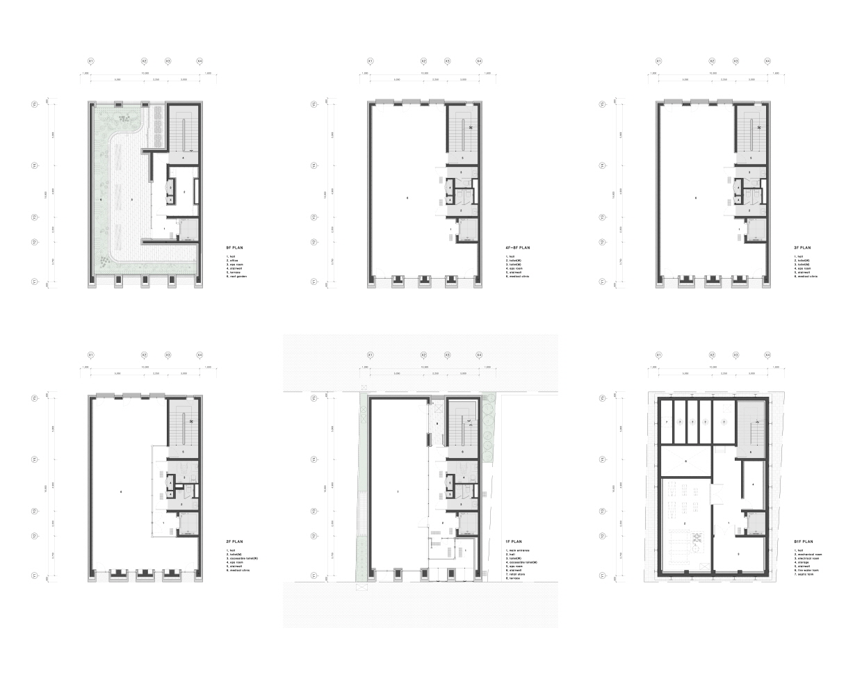
Building area – 166.16㎡
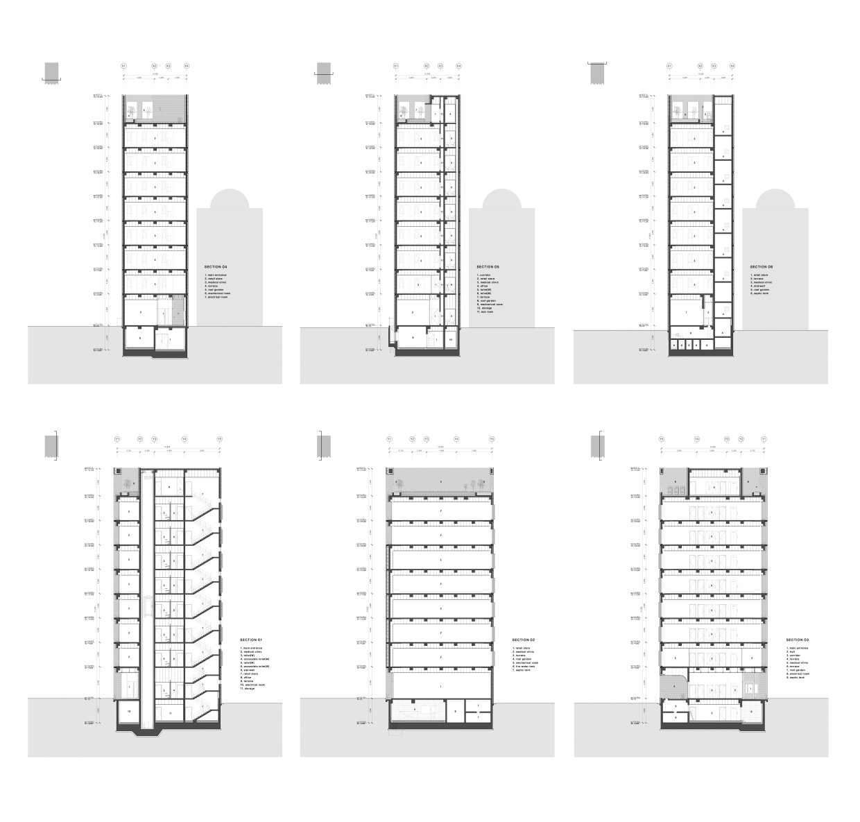
Gross floor area – 1,518.61㎡
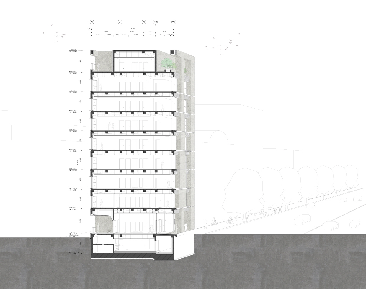
Building scope – B1F ~ 9F
Height – 38.2m
Parking – Restricted Parking Area
Structure – RC
Duration: 2021.11 – 2025.02
Architect – 아키도형건축사사무소 acdo architects
Photo – 표기 외 노경
Prologue
The client, who has operated hospitals and clinics in Busan for over 25 years, purchased a site along Gwangbok-ro boulevard to take the next step in their practice. Initially, they considered adding floors to the existing six-story building, but after several discussions, concerns over the inconvenient circulation of the old core and the structural safety of a building over 30 years old led them to decide on demolition and new construction. Although the building would not be large in scale, the client wanted it to stand prominently on Gwangbok-ro, combining the functionality of a hospital with the versatility of general rental spaces. Our design responded to these needs while pushing beyond the typical limitations of small commercial buildings in dense urban areas, creating an architecture with a confident, urban presence that engages directly with the 40-meter-wide boulevard.

대지분석
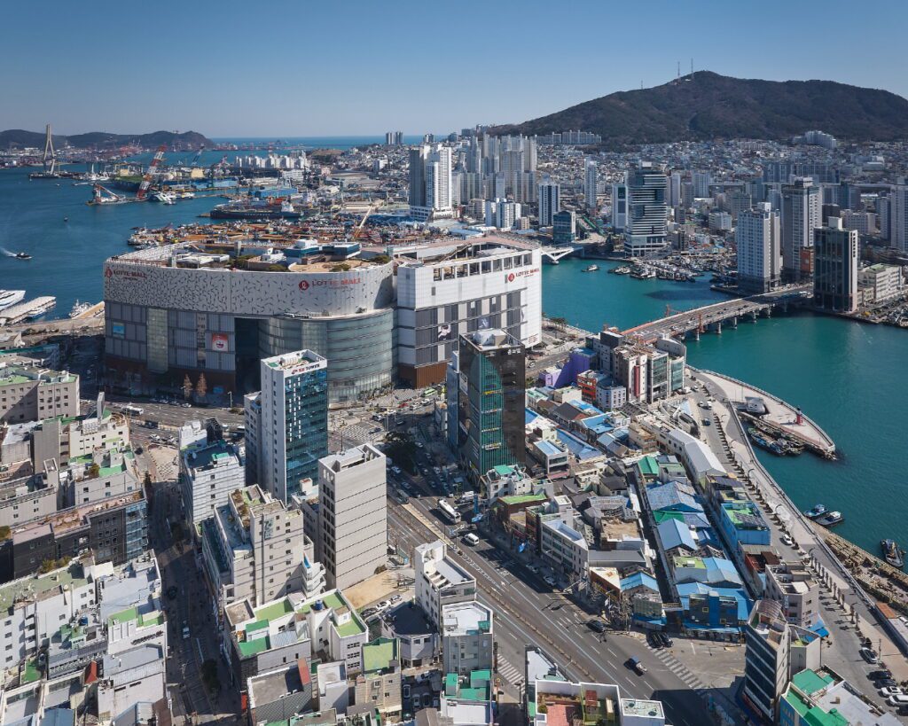
부산 광복동은 전통과 현대가 공존하는 지역으로, 매년 수많은 관광객과 외국인이 방문하는 부산의 대표 명소다. 복잡한 도시 구조 속 다양한 건물들이 오랜 세월을 거쳐 나름의 방식으로 모습을 드러내고 있고, 구도심 특성상 각양각색 개성 있지만 시대상도 미학도 다 다른 면면들이 뒤섞여 그자체로 도시안에 인정되며 공존한다.
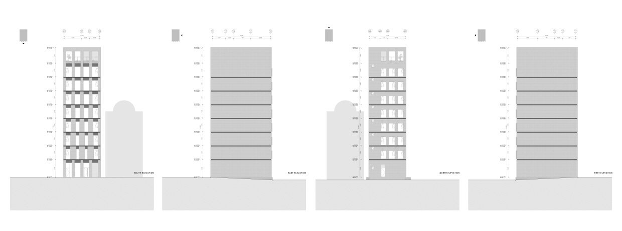
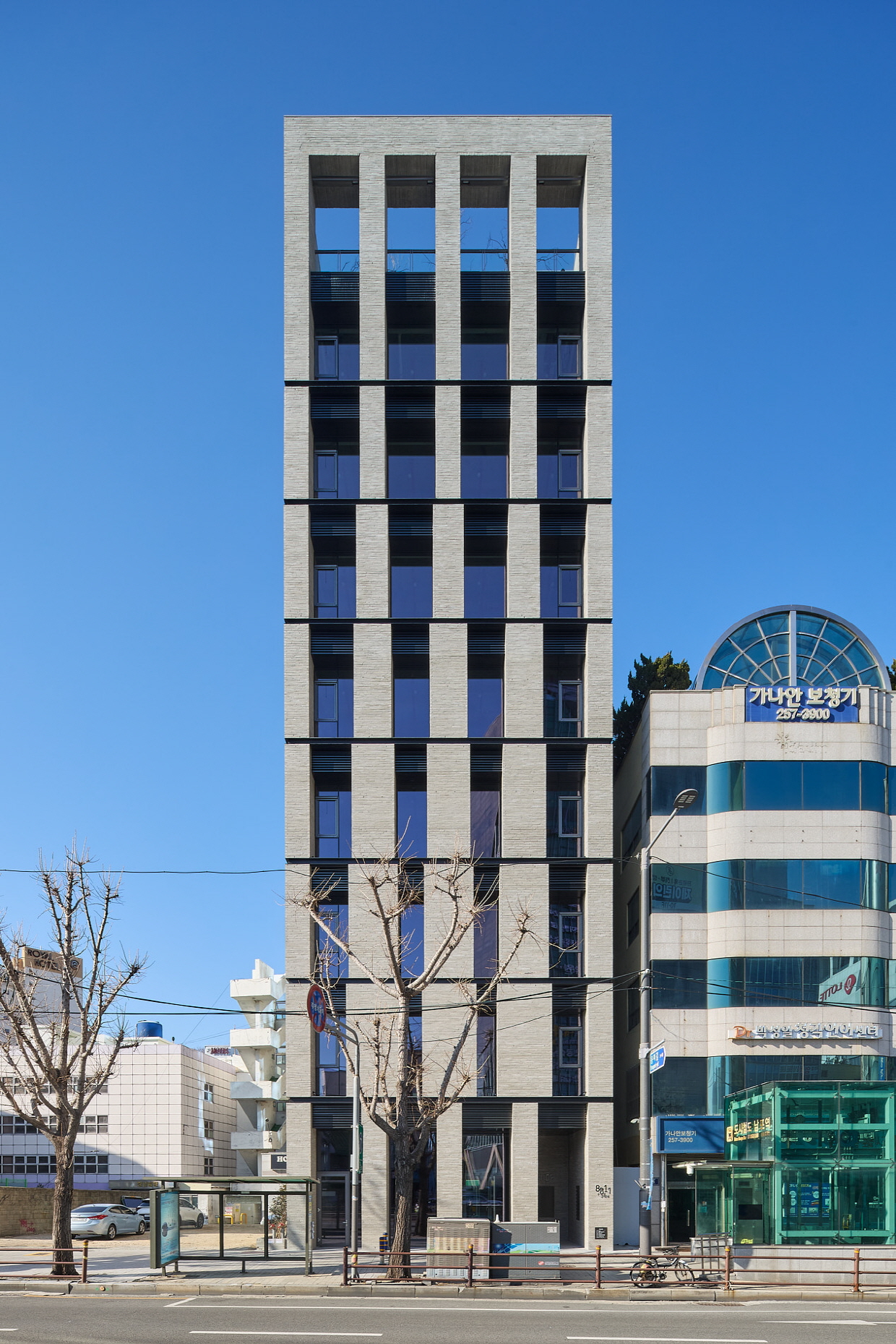
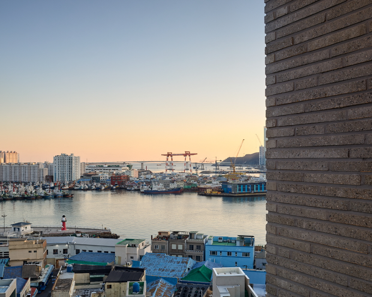
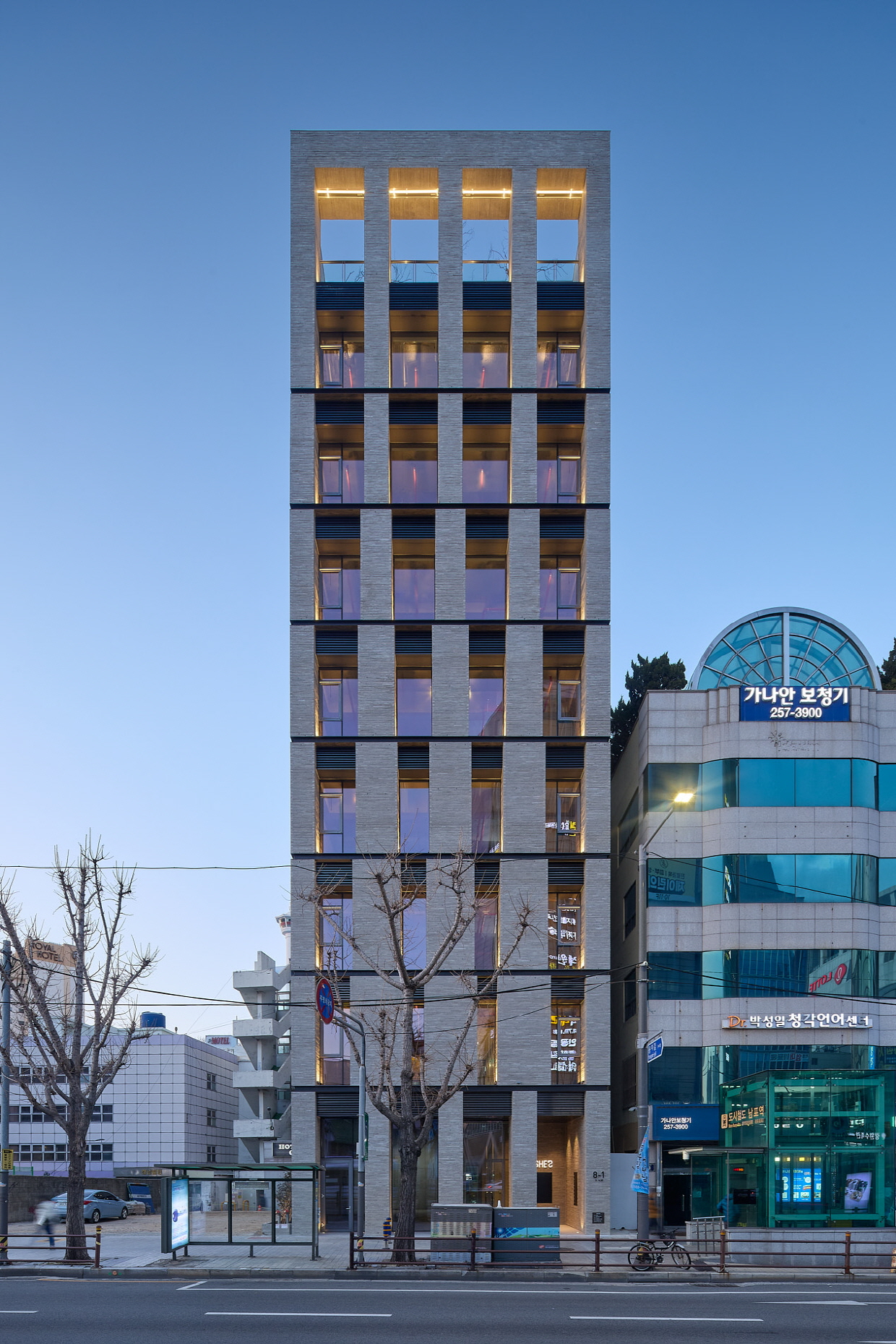
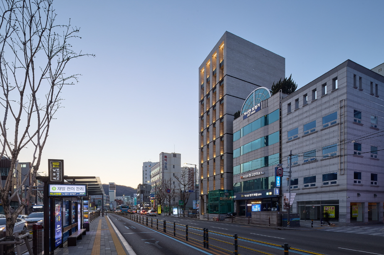
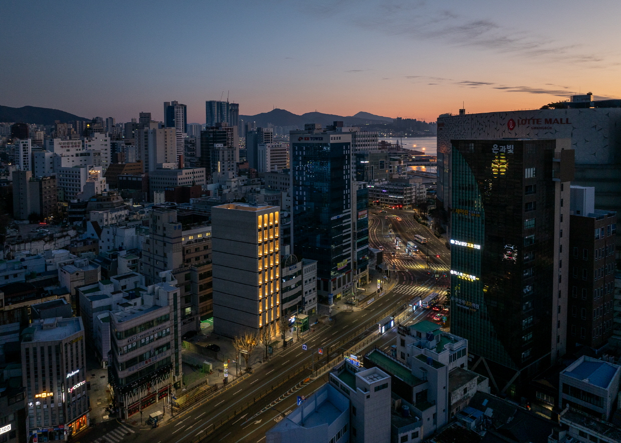
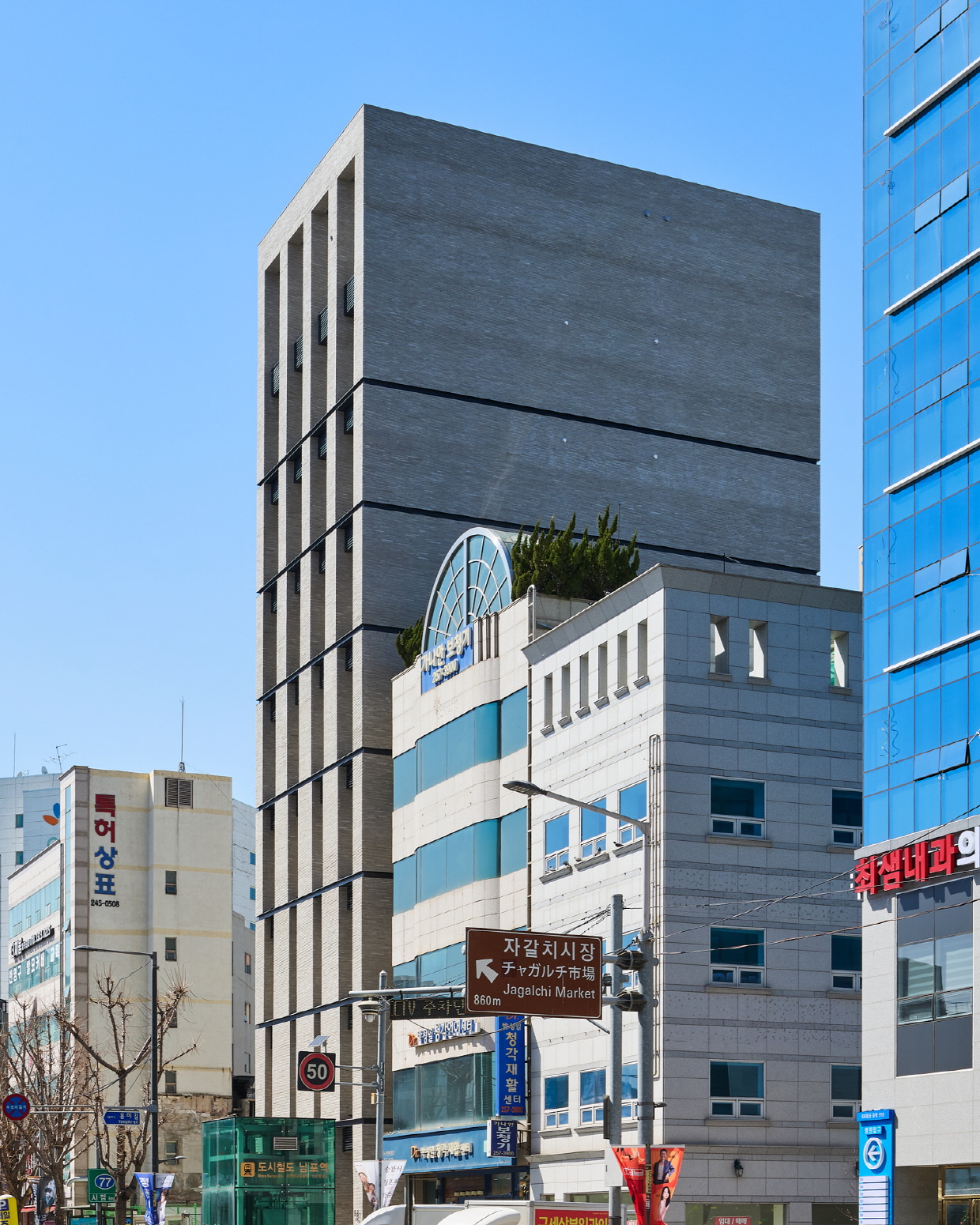
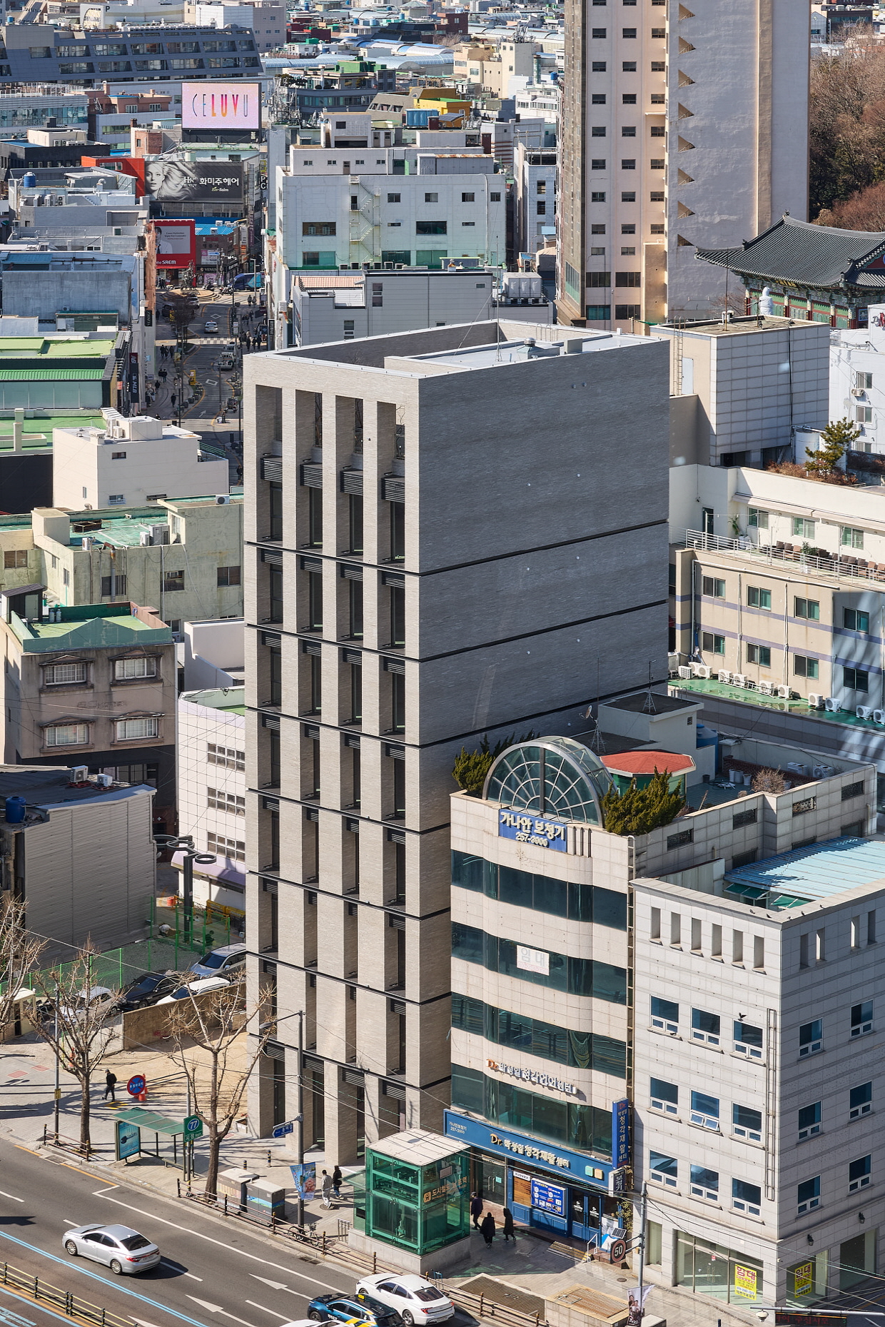
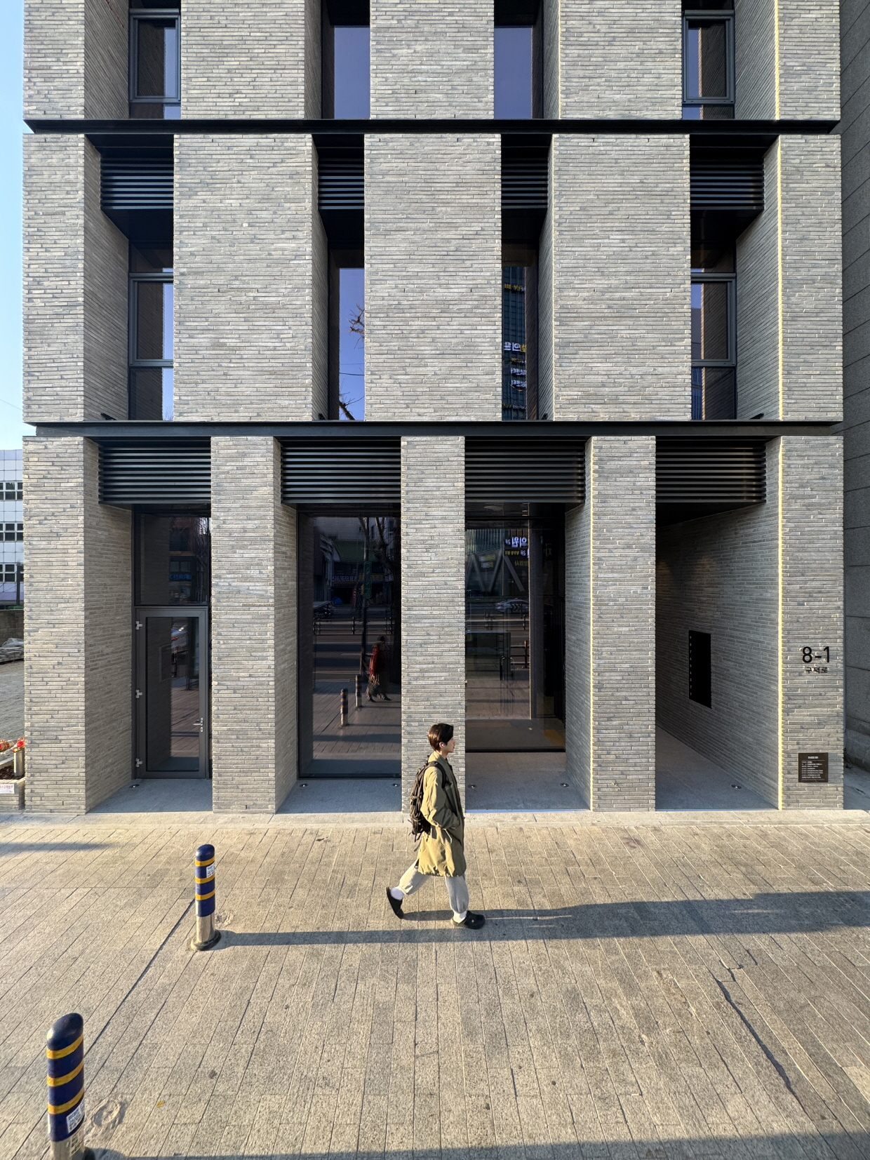
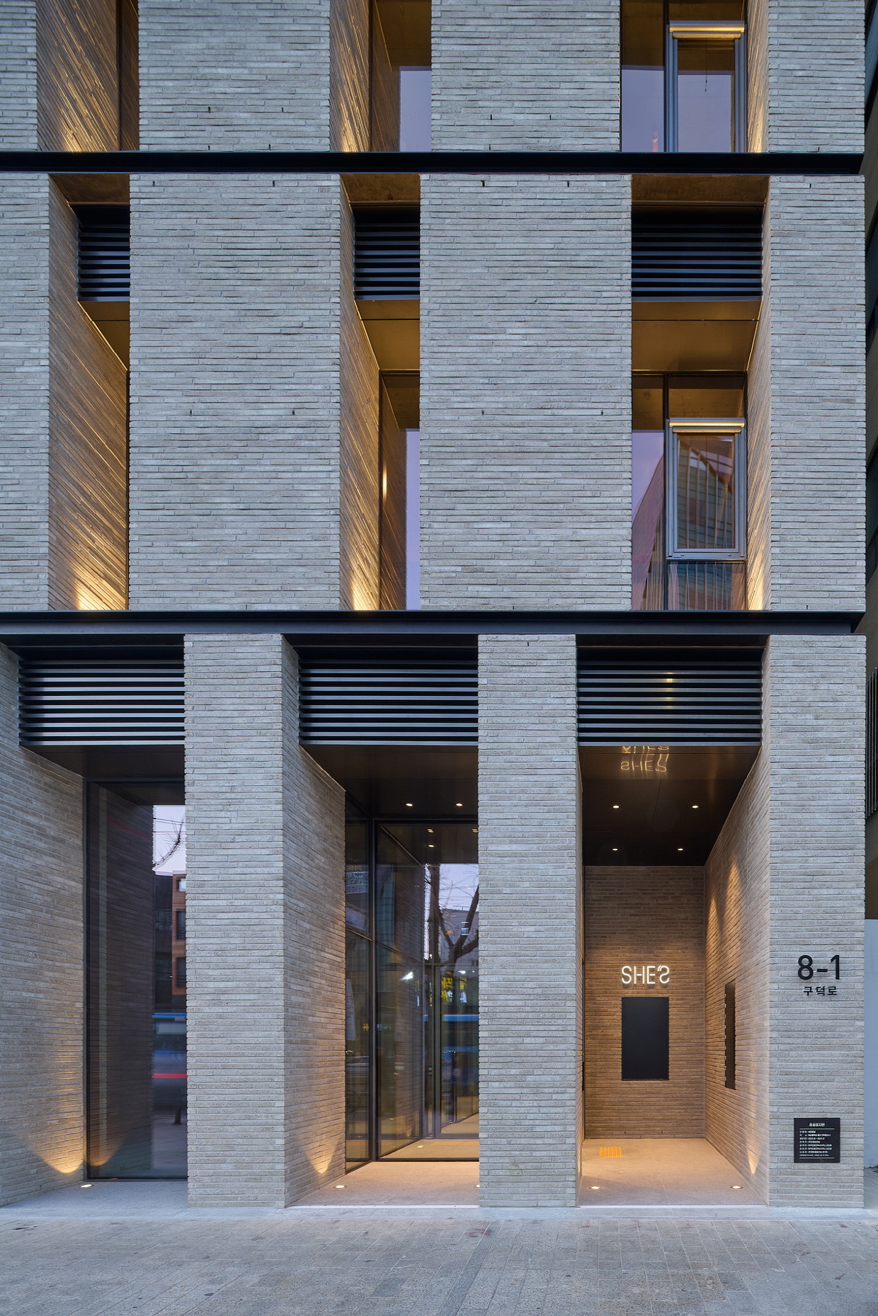
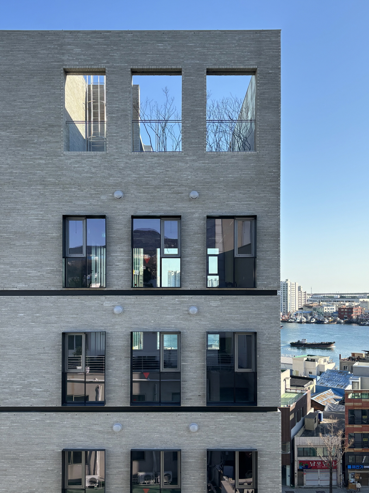
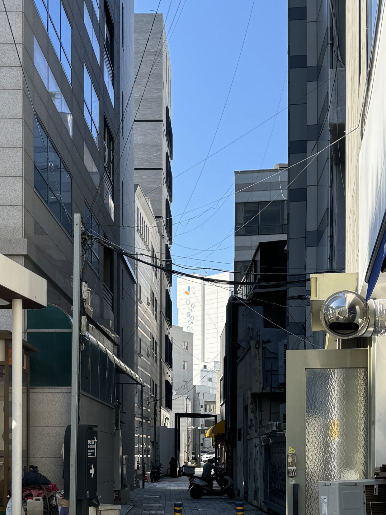
대지는 도시계획 차원의 관리를 시작한 경관지구를 마주한 대로변과, 아직은 구도심의 흔적이 남아 있는 후면의 경계에 자리한다. 남북 방향으로 길쭉한 직사각형 형태로, 전·후면 입면이 좁다. 남측 전면은 광복로 40m 대로에 면하고 있으며, 길 건너편으로는 자갈치시장과 바다가 펼쳐진다. 북측 후면은 남포동 구시가지 및 광복로 먹자골목과 맞닿아 있으며, 그 너머로 용두산공원과 부산타워가 시야에 들어온다. 대지의 좌우 측은 인접 건축물과의 이격 거리가 불과 1m 남짓에 불과하고, 상업지구 특성상 높게 지어질 수 있어 개방감이나 조망 측면에서 제한적인 조건이다.
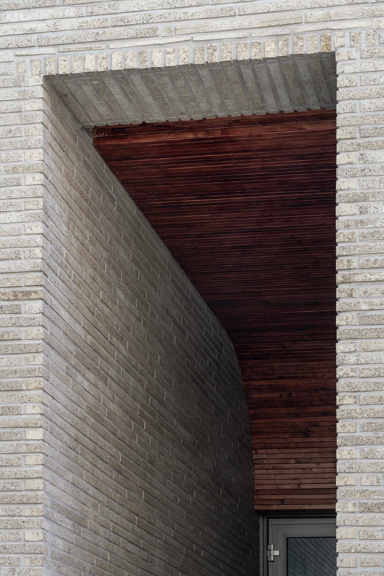
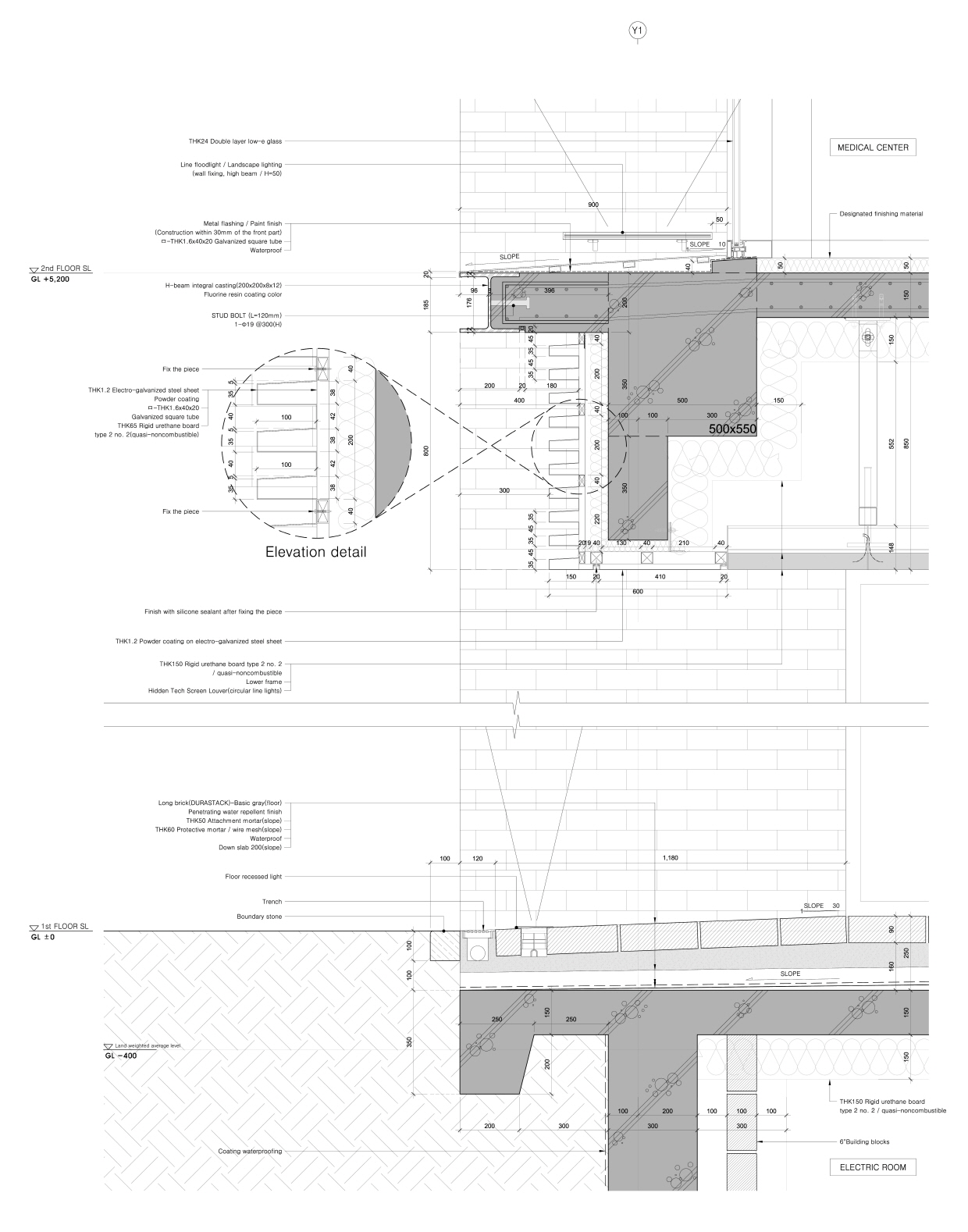
도시의 다양한 맥락과 조건에 노출된 대지에 대해, 각 방향과 상황에 유연하게 대응할 수 있는 건축적 전략을 모색했다. 방향마다 각기 처해진 서로 다른 물리적 환경을 디자인으로 반영하여 도시와 관계 맺기를 시도했다. 전면은 대로변 고층 빌딩의 도시적 스케일에 어울리는 대담한 파사드로 반응하고, 후면은 밀도 높은 구도심의 조밀한 도시 조직에 맞추어 작고 섬세한 박스형 개구부를 독립적 개체로 구성하여 돌출했다. 좌우 입면은 이러한 전·후면의 대비를 수용하는 캔버스(배경) 역할을 한다. 이는 방화지구 인접 건물과의 최소 이격 조건 아래, 창을 내기 위해서는 방화창 또는 드렌처를 설치해야 하는데, 이는 시공 비용 증가와 프라이버시 문제를 야기할 수 있어 이를 피하고자 취한 설계적 전략이기도 하다.
Site Analysis
Gwangbok-dong in Busan is a district where tradition and modernity coexist, attracting countless tourists and foreign visitors every year as one of the city’s signature destinations. Within its complex urban fabric, a variety of buildings have taken shape over time in their own ways. True to the character of an old city center, an eclectic mix of styles—each with different eras, aesthetics, and identities—coexist, collectively forming an accepted part of the city’s landscape.
The site sits between two contrasting contexts: the boulevard-facing front, part of a scenic district under urban design management, and the rear boundary, which still retains traces of the old downtown. It is a long, narrow rectangle oriented north–south, with limited width on both the front and rear façades. The southern front faces the 40-meter-wide Gwangbok-ro, with views across to Jagalchi Market and the sea beyond. The northern rear connects to the old downtown of Nampo-dong and the food alley along Gwangbok-ro, with Yongdusan Park and Busan Tower visible in the distance. On both east and west sides, the site is separated from neighboring buildings by barely more than a meter. Given the high-rise potential of the commercial zone, conditions for openness and views are limited.
For a site exposed to such a variety of urban contexts, we sought an architectural strategy that could respond flexibly to each direction and situation. The design reflects the unique physical environment of each side to establish a relationship with the city: a bold façade on the front to match the urban scale of boulevard-facing high-rises, and on the rear, small and delicate box-shaped openings projecting as individual elements to suit the dense texture of the old downtown. The side façades serve as canvases accommodating the contrast between the front and rear. This was also a strategic decision to avoid installing fire-resistant windows or drenchers, which are required when placing openings close to property lines in a fire protection zone—measures that would increase construction costs and potentially compromise privacy.

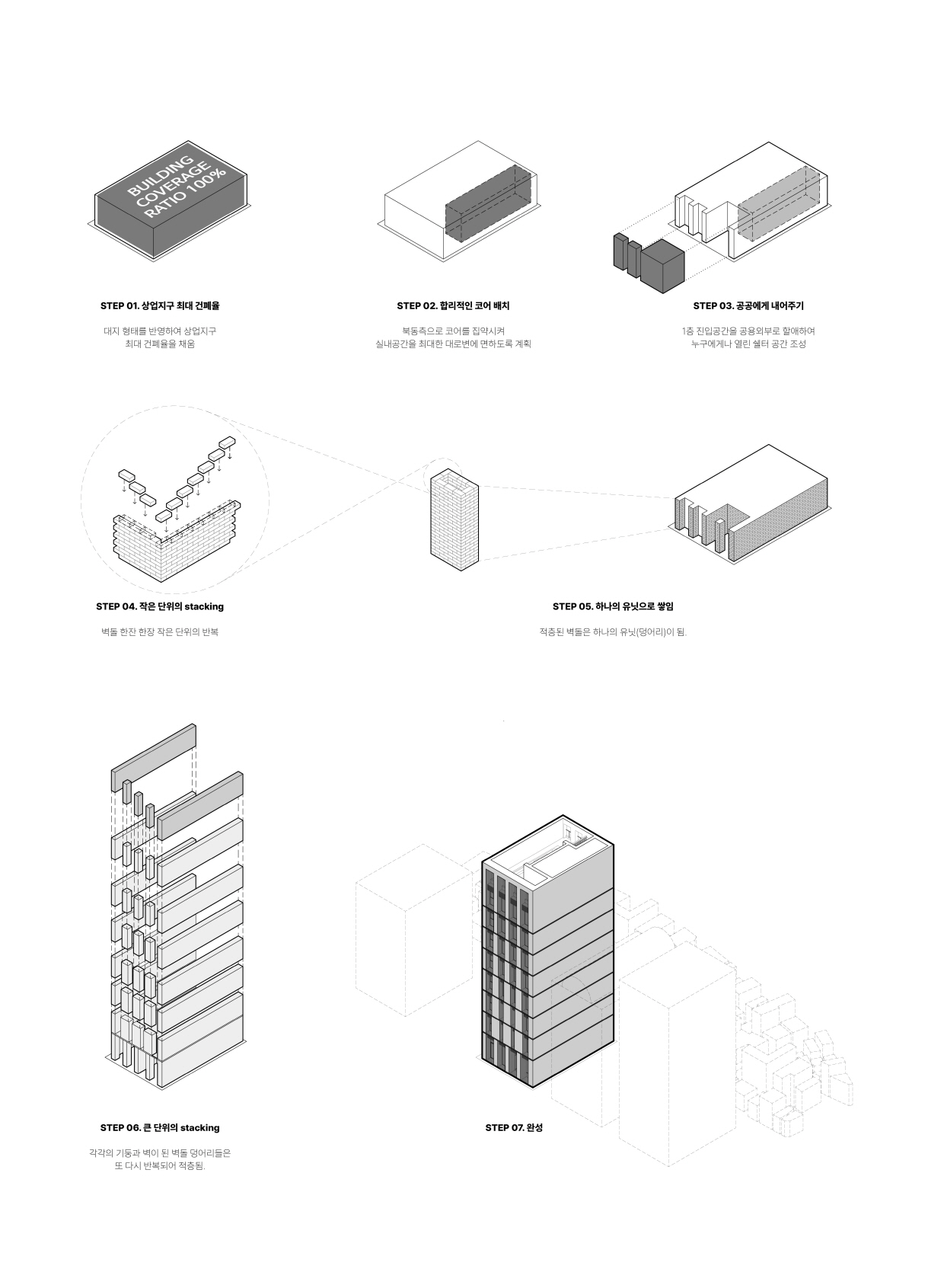
layered Monolith 작은 단위의 반복과 적층이 만든 단일체
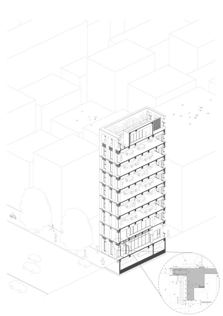
도시는 어떻게 창조성과 생명력을 얻는가? 도심지 상업지구의 건축은 단독주택과 같은 사적인 공간을 만드는 일과 조금은 구분된다. 불특정 다수가 이용하고, 도시의 가로 경관을 구성하는 한부분이 된다는 점에서 설계의 접근이 다르다. 특히 부산시 경관지구내에 위치한만큼 더욱 신중한 태도와 절제가 요구되었다.
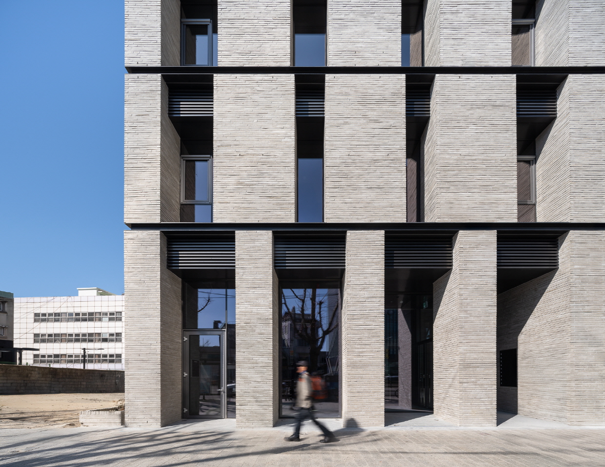
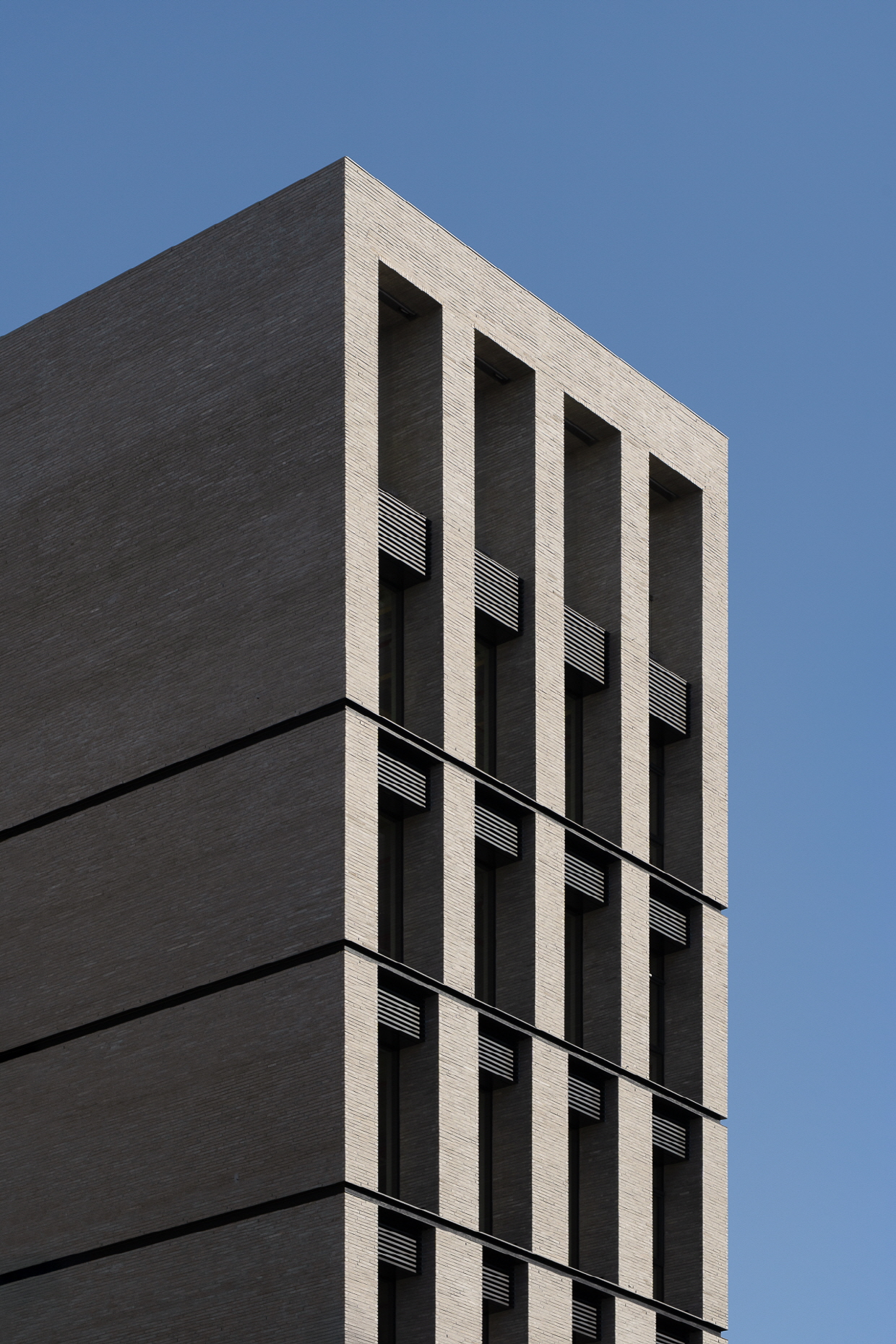
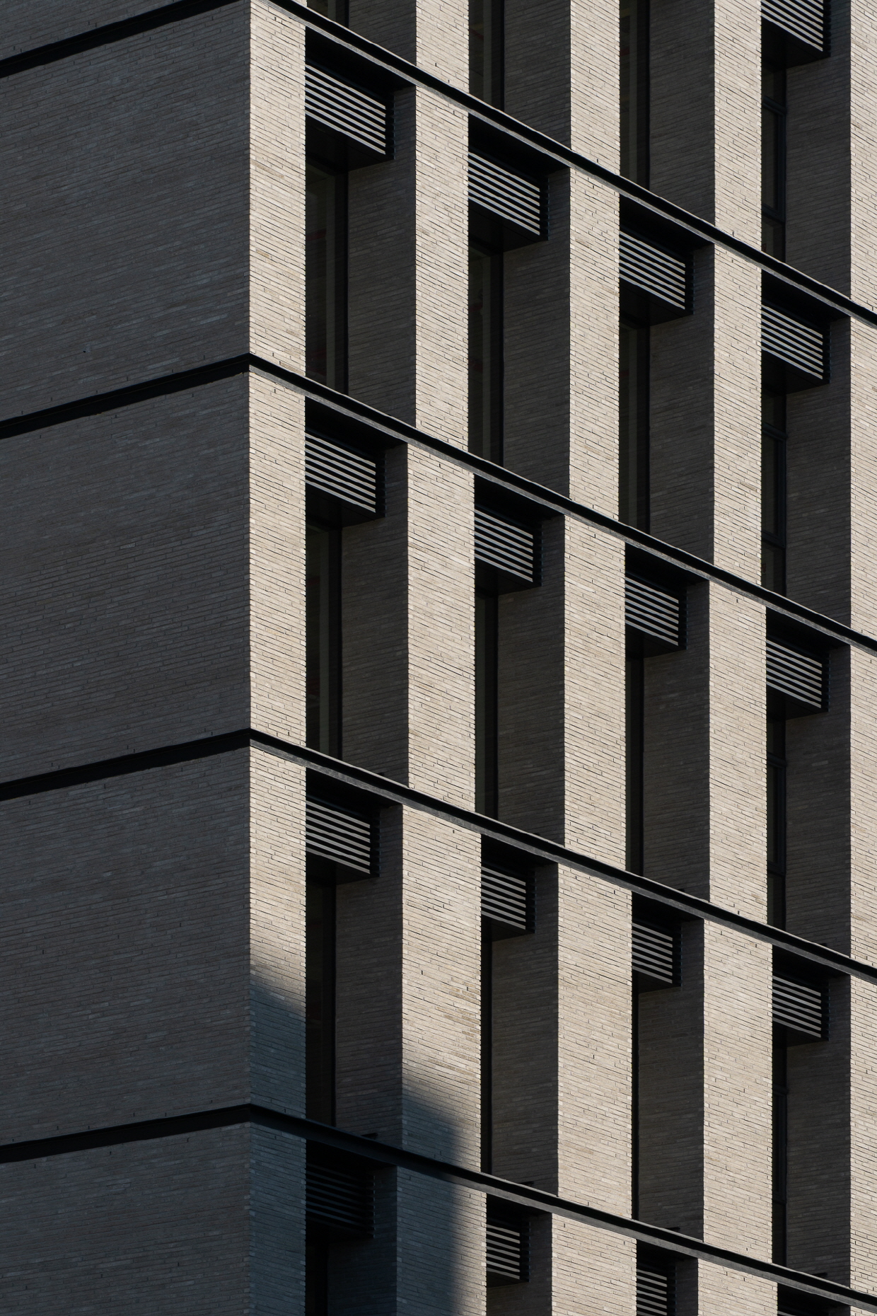
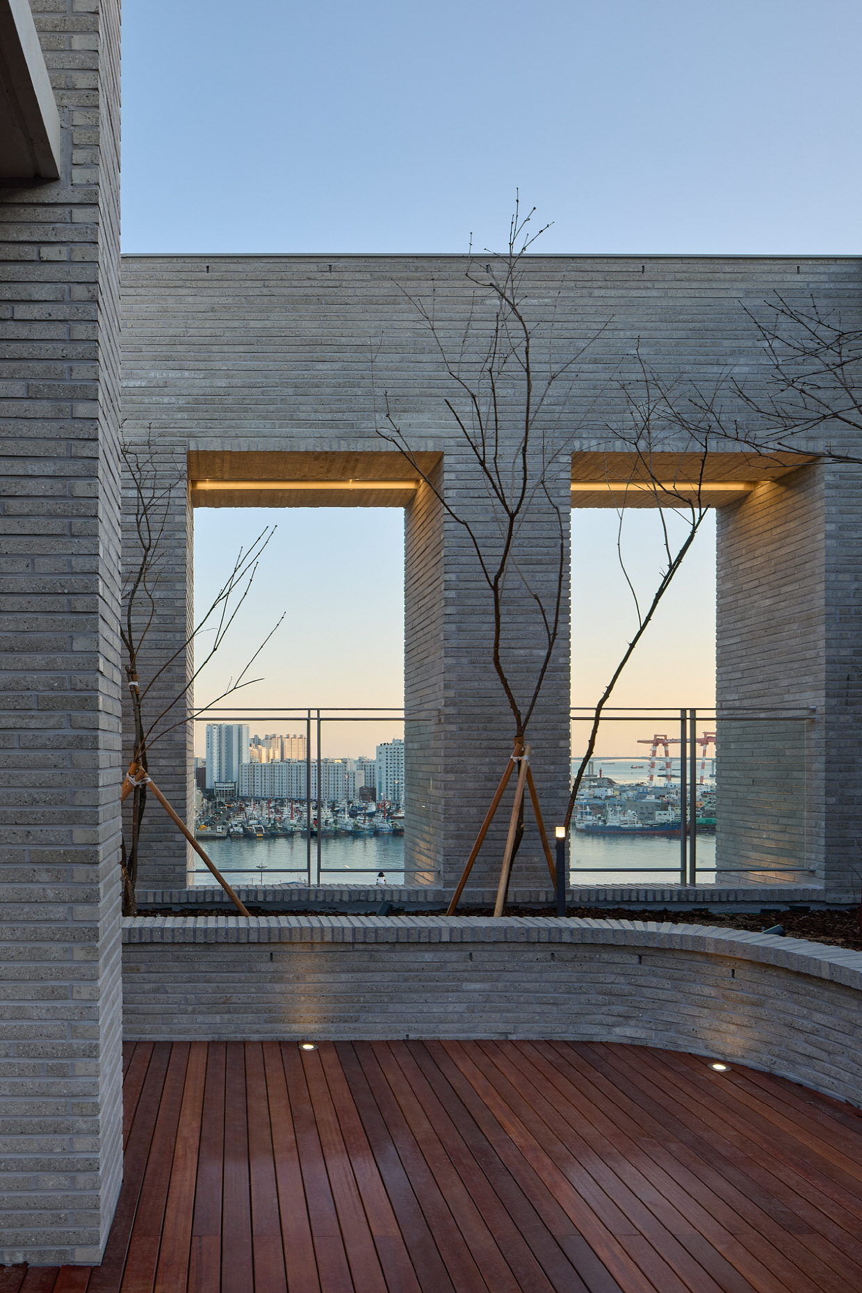
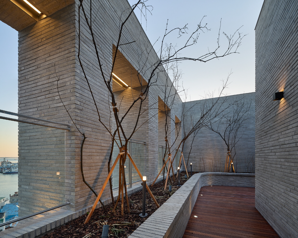
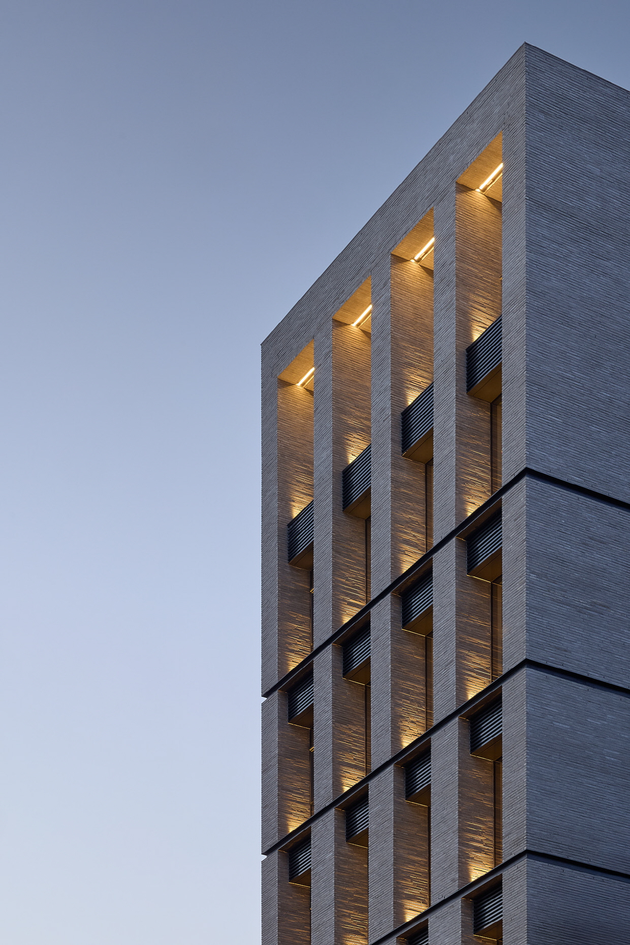
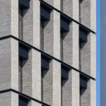
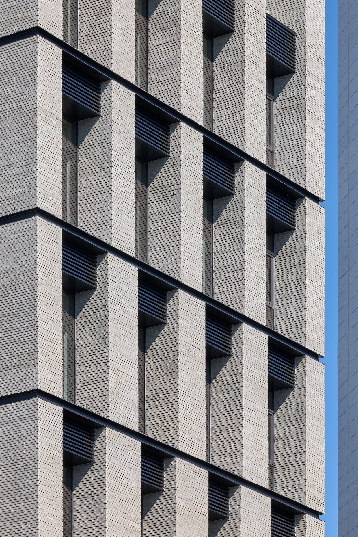
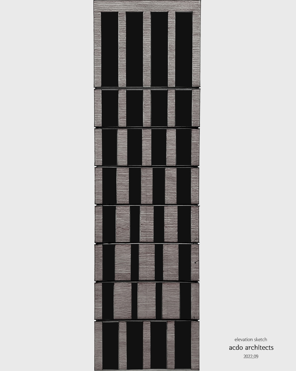
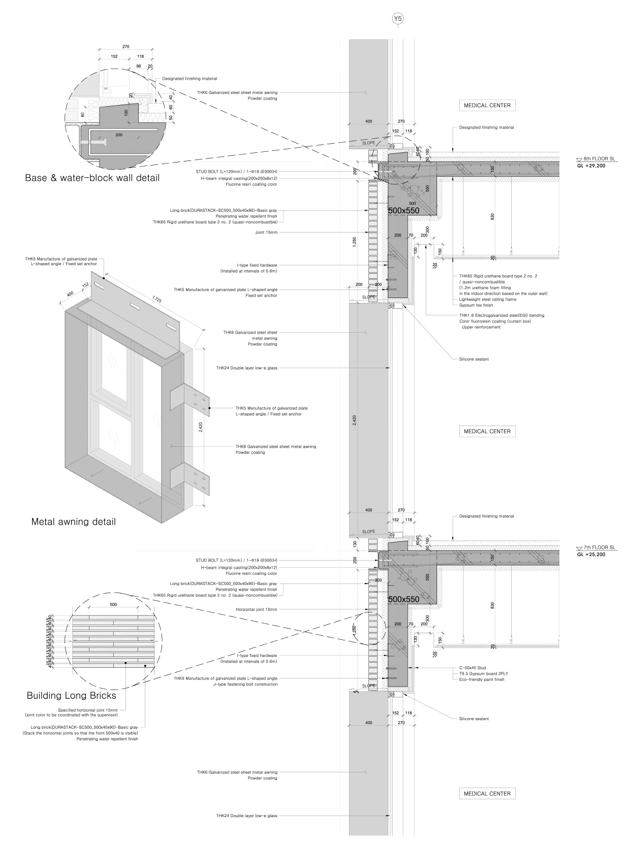
도시 안에 넘쳐나는 파편화되고 과잉된 형식에서 벗어나 절제된 질서를 찾고자 했다. 오히려 간결하고 작지만 담대한 하나의 매스를 통해 원 메터리얼 박스 형태를 취했다. 이는 단순한 구성 원리 속에 아름다운 비례를 담은 층간 분절, 입면의 디테일과 깊이감을 통해 구현되며, 그 안에 담기는 부산의 강렬한 빛과 그림자는 섬세한 공간의 원리를 더욱 극명하게 드러낸다. 대자연인 바다를 마주한 도시 구조 속에서 겸손하지만 조용히, 그러나 힘 있게 그 존재를 드러내는 방식이다. 가로를 걷다 마주하는 측면은 창조차 보이지 않는, 침묵하는 벽돌 덩어리처럼 보이길 의도했다. 작은 크기의 벽돌은 한 장 한 장 쌓여 하나의 유닛(덩어리)을 이루고, 건물에 다가갈수록 벽돌 유닛들은 의도된 규칙 속에 덩어리째 스태킹된다. 이는 상부로 갈수록 매스는 작아지고 오프닝(보이드)은 넓어지는데, 올라갈수록 바다 조망이 시원하게 열리기 때문이다. 반면 저층부는 비교적 조망이 부족하고, 프라이버시 확보를 위해 오히려 벽돌 매스(솔리드)의 비중을 높이고 개구부는 최소화하였다. 이는 의료시설이 입점하는 저층부의 용도와 기능을 고려한결과이다. 이처럼 주변환경과 프로그램에서 오는 이슈를 디자인으로 적극반영하고 기능적이면서 합리성을 갖춘 미학은 당위성을 가지며 삶에도 깊게 관여될것이라 믿는다.
도심 한가운데, 고요히 울리는 건축은 보는 이의 감각을 깨우고, 도시의 감각을 되물어본다.
Layered Monolith — A Singular Form Created by Repetition and Stacking of Small Units
How does a city gain creativity and vitality? Architecture in urban commercial districts differs somewhat from creating private spaces like single-family houses. Because it is used by an unspecified public and becomes part of the city’s streetscape, the design approach must be different.
Being located within Busan’s designated scenic district, it required an especially careful and restrained attitude. We sought to find restrained order, escaping the fragmented and excessive forms overflowing in the city. Instead, we adopted a single, concise yet bold mass, taking the form of a monolithic material box. This is realized through floor segmentation with beautiful proportions within a simple compositional principle, and through the details and depth of the façade. The intense light and shadows of Busan further emphasize the subtle principles of space contained within. It is a way to reveal presence quietly, humbly, yet powerfully, within a city structure facing the vast natural sea. The side façades encountered along the street were intended to appear as silent brick masses, with no visible windows. Small bricks are stacked one by one to form a single unit, and as one approaches the building, these brick units are stacked in groups according to a deliberate rhythm. The upper floors gradually reduce in mass while openings (voids) expand, allowing unobstructed views of the sea. In contrast, the lower floors have relatively limited views and, to ensure privacy, the proportion of solid brick mass is increased and openings minimized. This responds to the programmatic needs and functional requirements of the lower floors, where medical facilities are located. By actively reflecting issues arising from the surrounding environment and program in the design, we believe that an aesthetic that is both functional and rational carries legitimacy and engages deeply with daily life.
In the heart of the city, architecture that resonates quietly awakens the senses of the observer and reexamines the city’s own sensibilities.
도시에서 건축이 가져야 할 지혜로움. 조금 내어주고 많이 얻는 방법에 대해서.
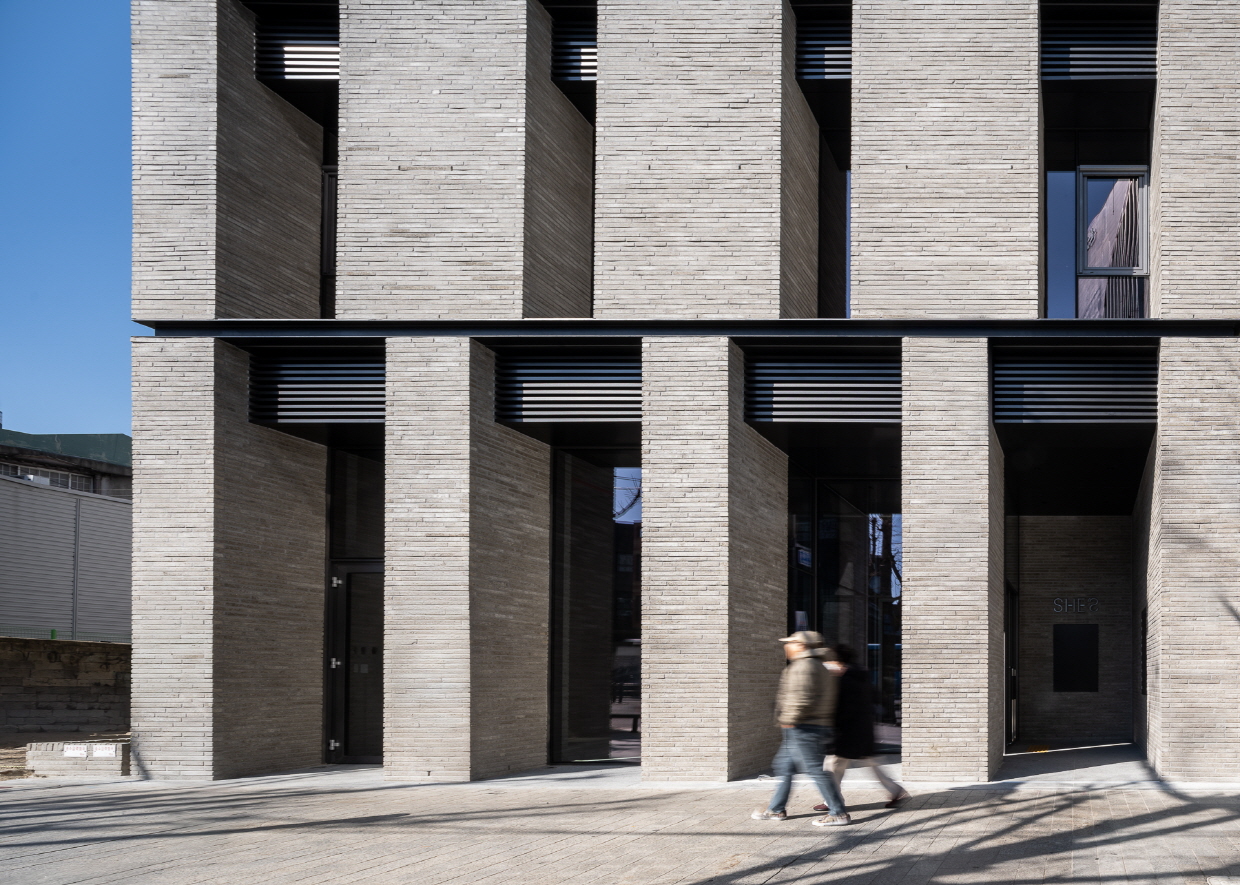
복잡한 도시. 때로 빛나는 것들은 낮고 조용한 곳에 깃들어 있다. 우리는 저층부 계획에 새로운 시도를 더했다. 일반적으로 1층은 임대 면적 확보에 주력하지만, 이 프로젝트에서는 1층 진입부 전이 공간을 건물 전체 구성의 전략적 장치로 삼고 일부 면적을 공공에 할애하였다. 혼잡한 도심 속을 걷다 마주하는 이 건축은, 오히려 예상치 못한 질서와 정돈된 규칙성에 의외성을 자아내게 만들고, 반복되는 기둥 사이 가장 오른쪽 공간을 비웠다. 노골적이지 않게 안으로 후퇴된 출입구는 일반 시민을 위해 언제든 열려 있고, 이는 보도와 단차도 없이 물리적으로 연결되며 시각적으로 확장된다. 의도된 공공적 배려는 단순한 진입 공간을 넘어 도심 속 쉘터로 기능하길 바랐다. 지나가던 사람들이 비를 피하거나, 그늘에 잠시 머물며 버스를 기다리는 등 특정되지 않은 이들의 일상적 행위들을 수용하는 공간적 여지를 만들고자 했다. 이는 도시의 활동적인 흐름이 자연스럽게 건물 내부로 이어지도록 유도하며, 건물로의 진입에 보다 나은 경험을 만들어 줄 것이다. 이 짧은 물리적 ‘산책’이 몇 제곱미터의 임대 면적을 확보하는 것보다 건축과 도시 전체를 바라볼 때 훨씬 더 큰 가치를 지닌다고 믿기 때문이다.
Wisdom in Urban Architecture: Giving a Little to Gain a Lot
A complex city. Sometimes, what shines is found in low, quiet places. We introduced a new approach to the design of the lower floors. Typically, the first floor focuses on maximizing leasable area, but in this project, the transitional entry space on the first floor was used as a strategic element of the building’s overall composition, dedicating a portion of the area to the public. Encountering this architecture while walking through a crowded city evokes unexpected order and surprising regularity. The space farthest to the right between the repeating columns was left empty.
A subtly recessed entrance, gently set back, remains open to the general public at all times, physically connecting to the sidewalk without steps and visually extending outward. This intentional act of public consideration was designed to function beyond a mere entry space—as a small urban shelter. It provides spatial allowance for unassigned everyday activities: people seeking shelter from the rain, resting in the shade, or waiting for a bus. Such design naturally draws the city’s active flow into the building, enhancing the experience of entering the structure. We believe this short, physical “walk” offers far greater value when considering the building and the city as a whole than simply securing a few square meters of leasable area.
도시의 스케일에 눈을 맞추는 방법.
구도심을 향한 입면은 저층 고밀도의 도시 맥락에 맞춰 작게 분절되었다. 나누어진 각각의 개구부는 독립적으로 돌출되어 주변의 리듬과 조응을 이루고 비교적 높은입면이 과도하게 느껴지지 않도록 조율하며, 구도심의 스케일에 스며들도록 배려되었다.
Aligning with the Scale of the City
The façade facing the old downtown was segmented into smaller units to respond to the dense, low-rise urban context. Each divided opening projects independently, interacting with the surrounding rhythm, moderating the perception of the relatively tall elevation, and allowing the building to blend harmoniously with the scale of the historic city fabric.

건축은 도시로부터 어떤 모습을 기대받는가?
‘경관지구’라는 행정적 언어는 그 안에 여러 암묵적 기대가 있다. “보이는 것은 아름다워야 한다, 주변 맥락과 조화를 이루어야 한다.” 이러한 조건은 외형적 정합성과 시각적 질서를 강요받고 길들인다. 규칙과 규범이라는 이름으로 건축이 스스로 사고하고 발언할 수 있는 건축적 자율성의 여지를 차단한다. 우리는 표정 없는 이 측벽을 통해 조용히 도시에 반문한다. 아름답다는 기준은 누구의 시선에서 비롯되는가? 무표정한 이 벽은 주변 도시의 과잉된 표면을 되비추고, 도시 속에 건축이 어떤 태도를 가질 수 있는지 보여주는 역설이다. 이는 단지 그 자리에 ‘놓여’ 있는 구축의 표정일 뿐이다. 이 측벽은 도시의 미관에 물음표를 던지는 트리거가 될 수 있을까?
What Does Architecture Expect from the City?
The administrative term “scenic district” carries with it a number of implicit expectations: “What is seen must be beautiful; it must harmonize with the surrounding context.” These conditions impose conformity and visual order, limiting the building’s freedom to think and express itself. Through this expressionless side wall, we quietly question the city. From whose perspective is “beauty” defined? This neutral wall reflects the excessive surfaces of the surrounding urban fabric and presents a paradox, showing what attitude architecture can take within the city. It is merely the expression of a structure that exists in that place. Could this side wall serve as a trigger, posing a question about the city’s notion of aesthetics?