

프롤로그
P&F는 선진 의료 환경을 위한 우수한 의료기기를 수입·개발·공급하는 기업으로, 기존에는 판교 테크노밸리 내 오피스를 사용해 오다 새로운 사옥 신축을 위해 우리를 찾았다. 의료기기 사업 특성상 제조와 사무 기능이 분리되고, 해외 및 국내 영업팀이 자연스럽게 교차 소통할 수 있는 하나의 통합된 헤드오피스를 요구했다. 이에 따라 우리는 오피스, 회의실, 직원 복지시설 등을 갖춘 기능적 공간을 계획함과 동시에, 소규모 근린생활시설이 가질 수 있는 새로운 건축적 가능성을 모색했다. 성장 중인 기업의 첫 사옥인 만큼 상징성을 담고자 했으며, 동시에 현실적인 공사비 또한 중요한 과제로 고려되었다. 또한 향후 이 건물이 새로운 주인을 만나게 된다면 그 상황에도 유연하게 활용될 수 있도록, 기능과 구조의 합리성을 염두에 두었다. 설계와 감리에 2년 3개월, 153번의 현장 감리. 건축 설계와 인테리어, 가구와 사이니지까지 할 수 있는 모든 걸 했던 P&F 프로젝트가 모습을 드러낸다.
Project – P&F HEAD OFFICE
Location – Yul-dong, Bundang-gu, Seongnam-si, Gyeonggi-do
Programme – Commercial
Site area – 429㎡
Building area – 120.51㎡
Gross floor area – 589.29㎡
Building scope – B1F ~ 4F
Height – 19.9m
Parking – 4
Structure – RC
Duration: 2022.01 – 2024.05
Architect – 아키도형건축사사무소 acdo architects
Photo – 노경
Prologue
P&F is a company that imports, develops, and supplies high-quality medical equipment for advanced healthcare environments. Previously operating from an office in Pangyo Techno Valley, they approached us for the construction of their new headquarters. Given the nature of the medical device business, manufacturing and office functions needed to be separated, while enabling natural cross-communication between overseas and domestic sales teams within a single, unified head office. In response, we designed a functional space equipped with offices, meeting rooms, and employee welfare facilities, while also exploring new architectural possibilities for a small-scale neighborhood living facility. As the company’s first self-owned building, it was important to imbue the project with symbolic significance, while also keeping construction costs within practical limits. Additionally, we considered functional and structural rationality so that the building could be flexibly adapted should it be passed on to a new owner in the future. Two years and three months of design and supervision, 153 on-site inspections. From architecture and interior design to furniture and signage, we brought every possible aspect together—culminating in the unveiling of the P&F Project.
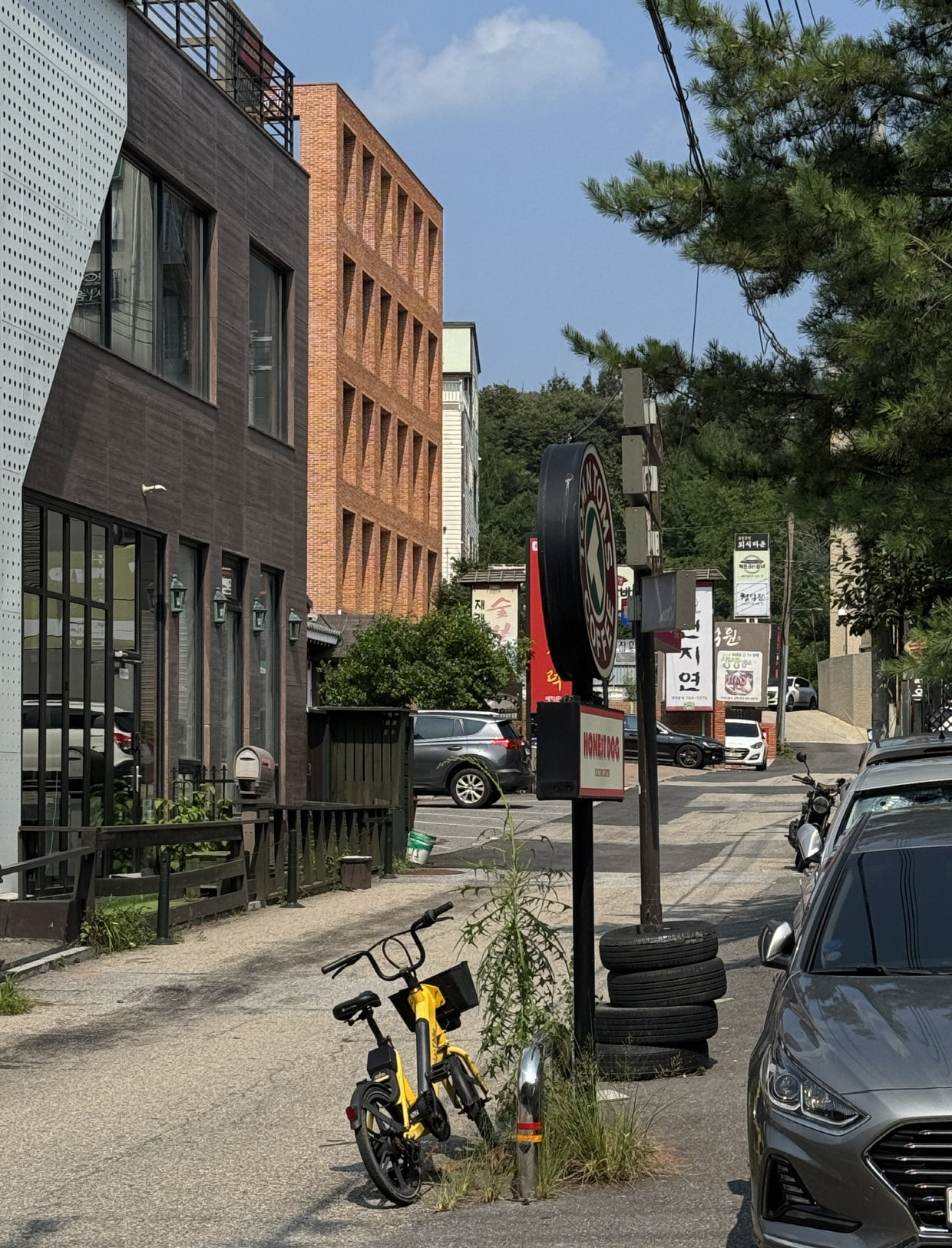
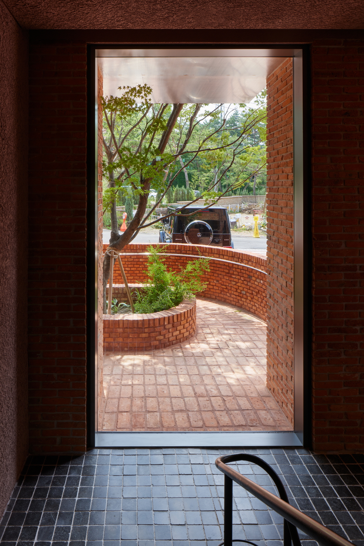
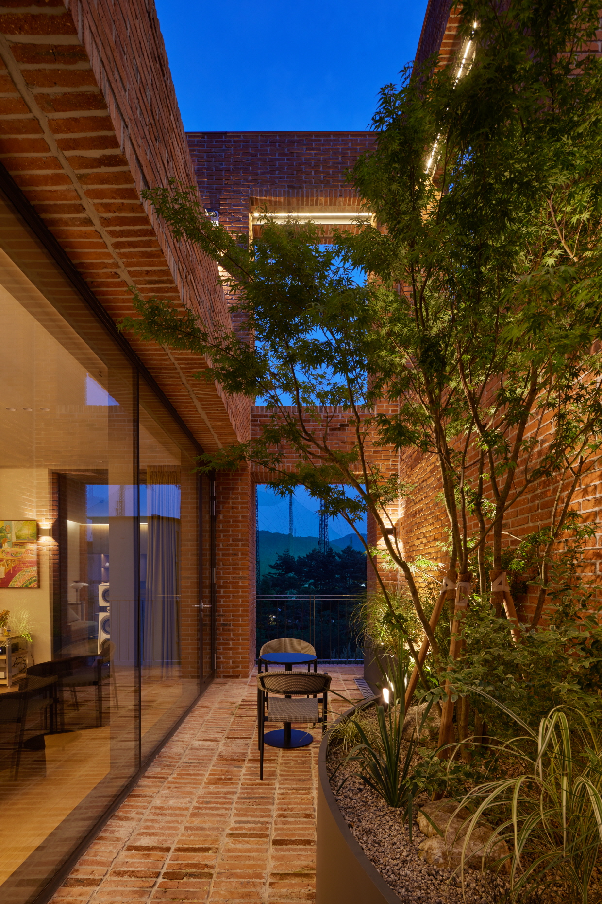
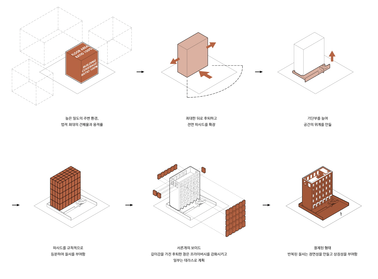
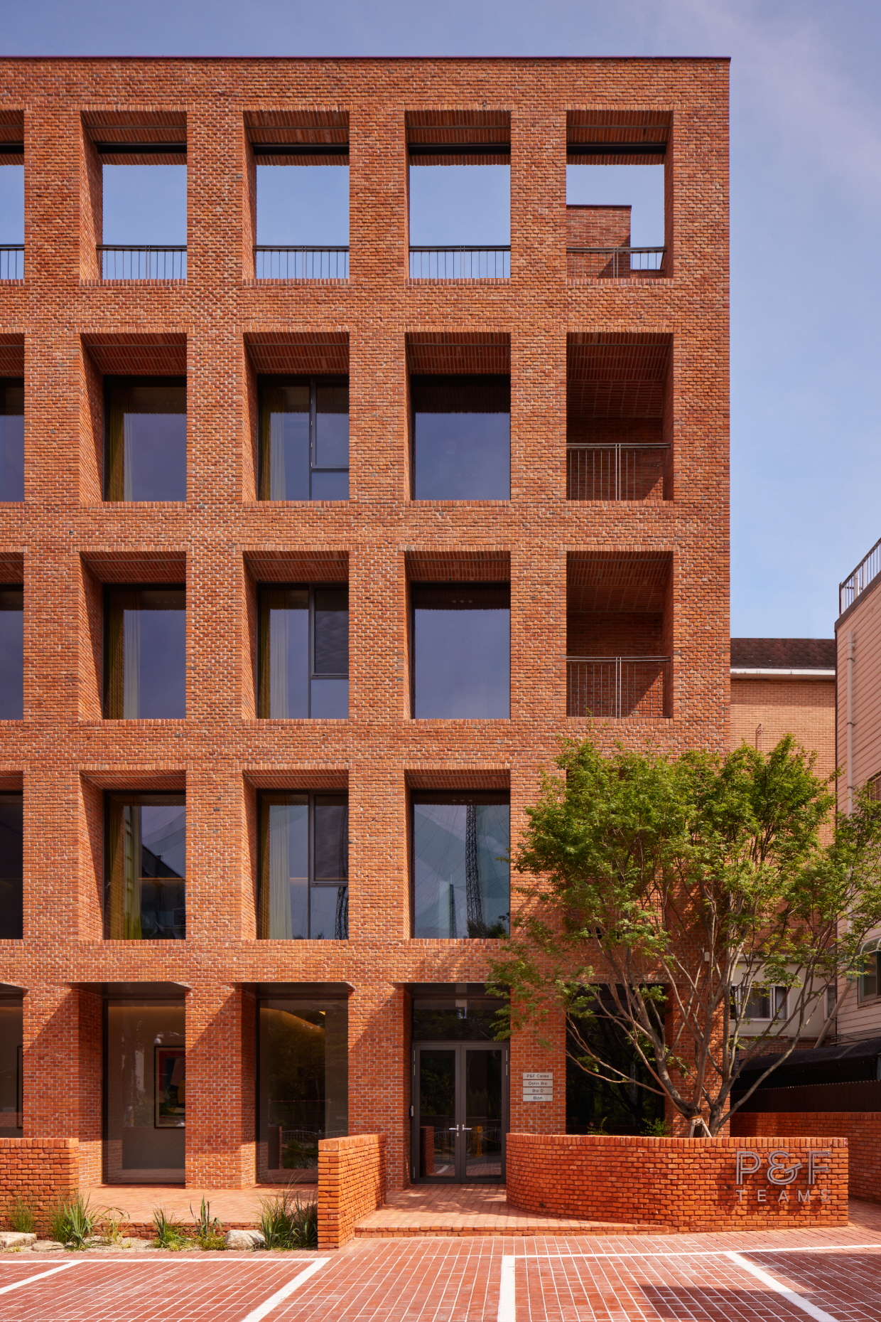
대지는 분당구 율동공원에 인접한 소규모 상업지에 위치한다. 막다른 골목 끝 대지는 도로 구조상 좁은 골목길을 따라 측면을 응시하며 길게 접근되는 동선으로, 자연스럽게 정면보다 측면이 먼저 눈에 들어오는 방식으로 접근하게 된다. 또한, 대지의 삼면이 음식점으로 둘러싸여 있어 기업 사옥으로서는 환경적으로 불리한 조건을 안고 있었다. 다행히 전면에는 공공 놀이터와 맞닿아 있어 시선이 열려 있고, 건물을 대지 안쪽 깊숙이 배치함으로써 프라이버시를 확보할 수 있을 것으로 판단했다. 그중에서도 사이트에서 읽은 가장 핵심적인 단서는 ‘낮은 건폐율’과 ‘후퇴한 정면’의 가능성이다. 낮은 건폐율로 인해 부득이 공지가 생기는 상황에서 앞마당을 넓게 확보하면서 건물의 전면을 뒤로 최대한 물렸다. 이러한 배치는 건물의 정면을 온전히 관망할 수 있는 거리를 만들어 주어 기업 사옥으로서의 상징성을 부여한다. 우리는 이 지점에 주목하여 건축을 바라보는 각각의 시점에 대해 나누어 생각해 보았다.
첫째, 좁은 골목길로 진입하면서 멀리서 마주하는 측면의 시점.
둘째, 다가가 건물 정면에서 관망하듯 바라보는 시점.
셋째, 벽돌을 밟고 가까이 다가서 건물의 소재가 손에 닿는 순간의 시점을 구분해서 보길 바랐다.
이처럼 건축의 상징성과 시점이 만들어내는 장면성을 담기 위해, 바라보는 방향과 거리에 따라 변화하는 시퀀스에 주목하고, 그에 맞는 건축적 해석을 만들어 나갔다.
The site is located in a small commercial area adjacent to Yuldong Park in Bundang-gu. Positioned at the end of a cul-de-sac, it is approached via a narrow alley that naturally presents the building’s side façade before the front comes into view. Adding to the challenge, the site is surrounded on three sides by restaurants—an environmental disadvantage for a corporate headquarters. Fortunately, the front faces a public playground, allowing for an open line of sight, and by positioning the building deep within the plot, we could secure a degree of privacy. The most important clues we drew from the site were the potential offered by its low building coverage ratio and a set-back frontage. Given that the low coverage ratio inevitably created open space, we decided to push the building’s front back as far as possible, creating a spacious forecourt. This arrangement allowed the building’s front façade to be appreciated from a proper viewing distance, giving it the symbolic presence of a corporate headquarters. Focusing on this point, we considered the architecture in terms of three distinct perspectives:
1. The view of the side facade encountered from a distance while approaching through the narrow alley.
2. The view from directly in front, observing the building as a whole.
3. The close-up view, when stepping onto the brick paving and experiencing the texture of the building’s materials by touch.
To capture the symbolic presence of the building and the scenes shaped by these perspectives, we focused on the sequential changes in viewpoint and distance, developing an architectural interpretation that responded to each moment of approach.
정면성 正面性
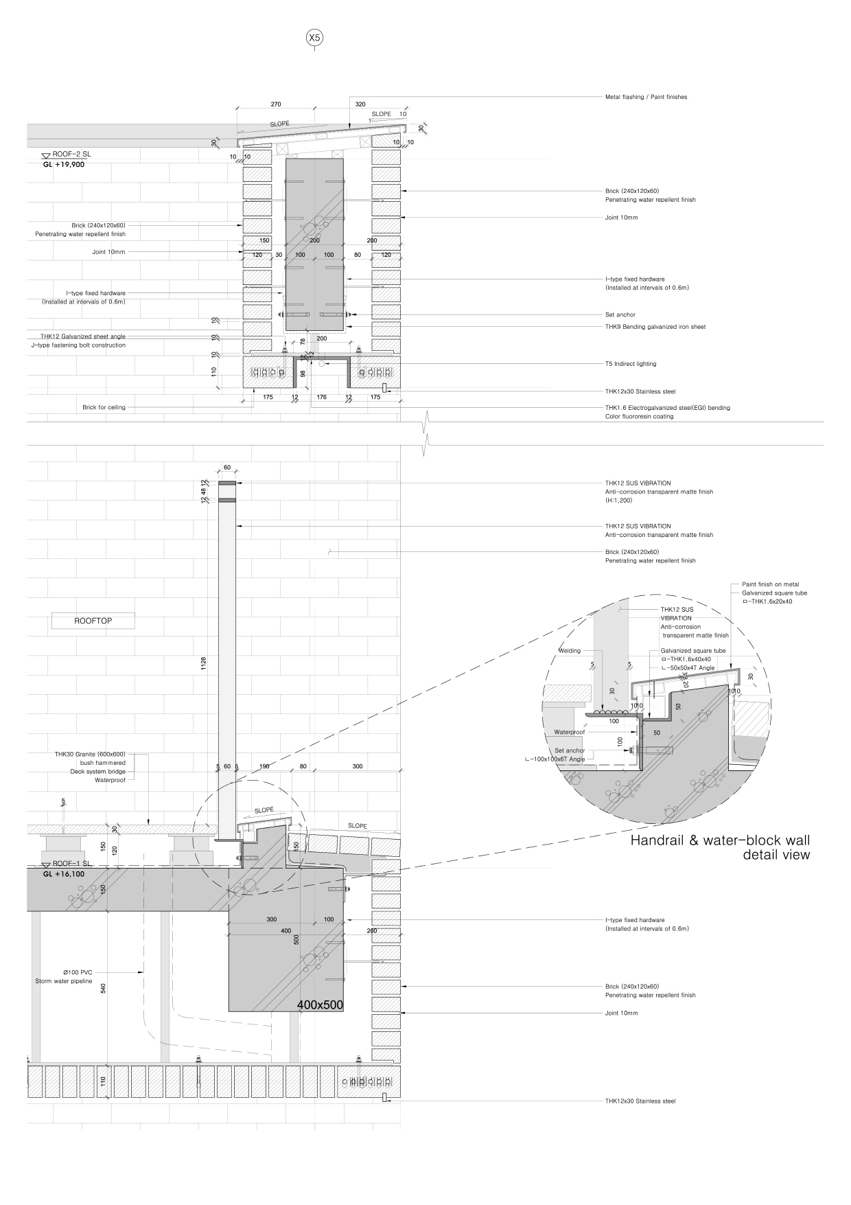
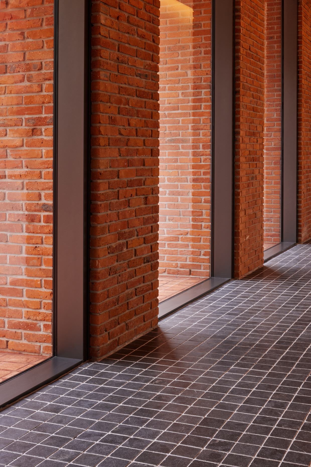
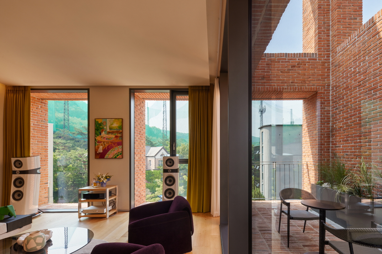
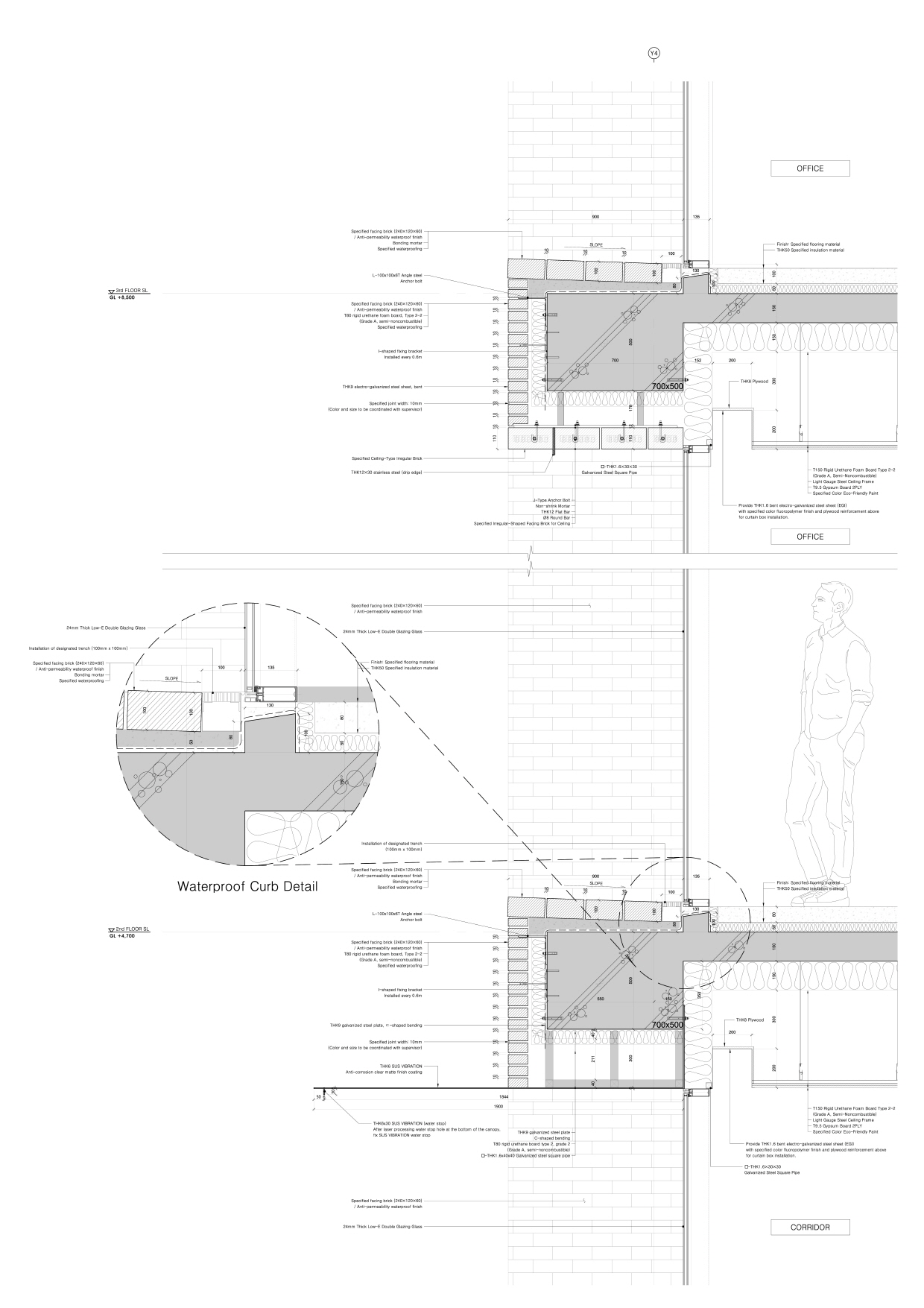
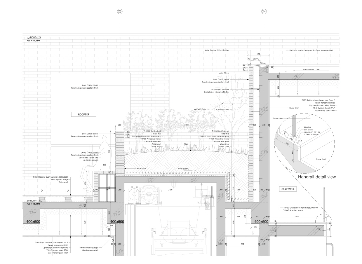
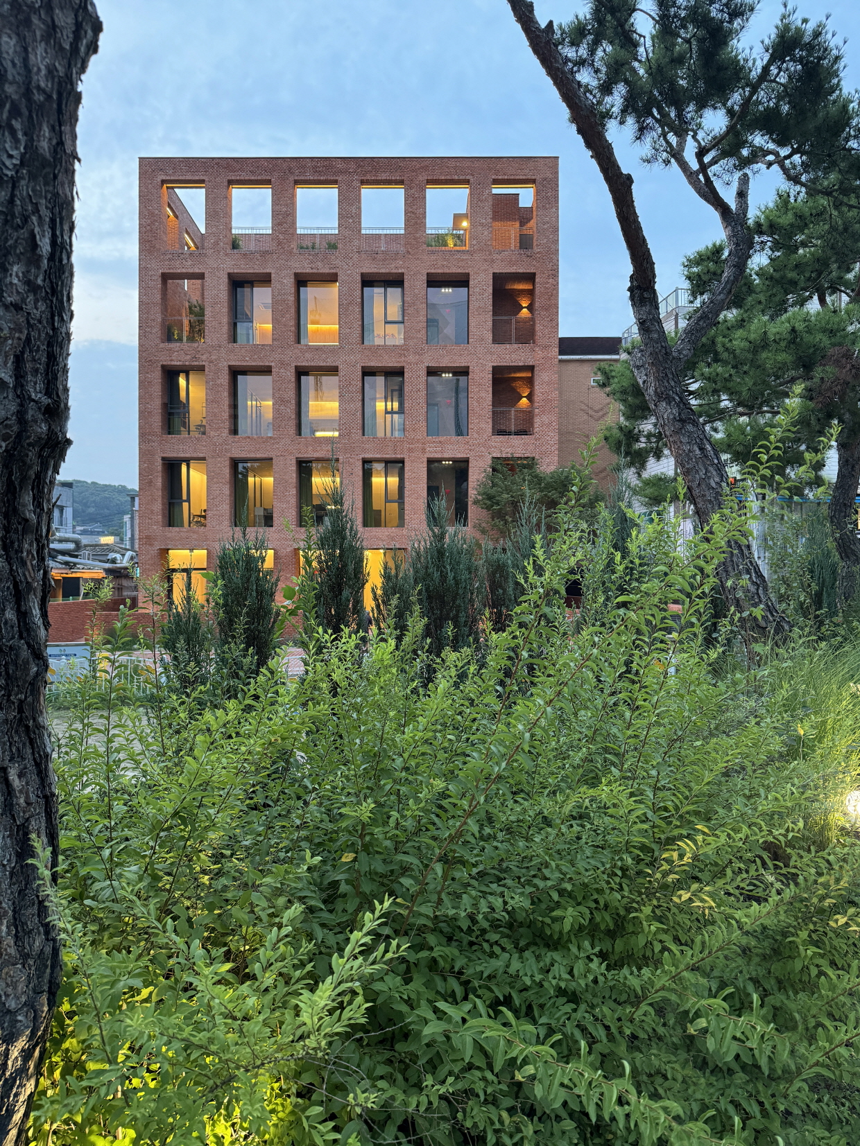
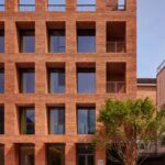
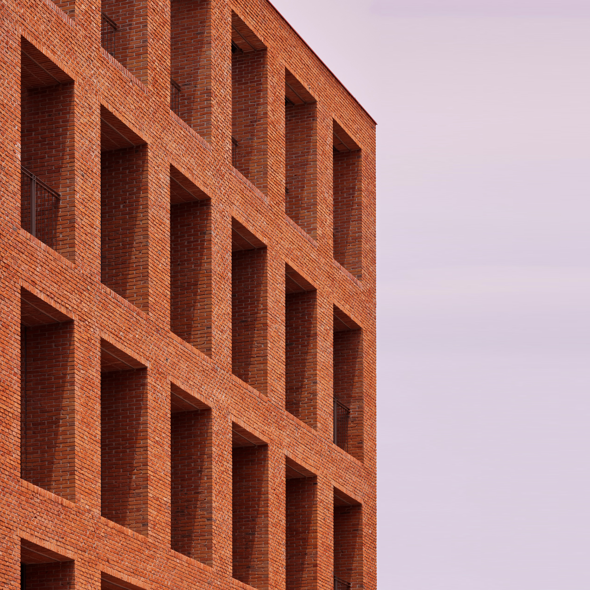
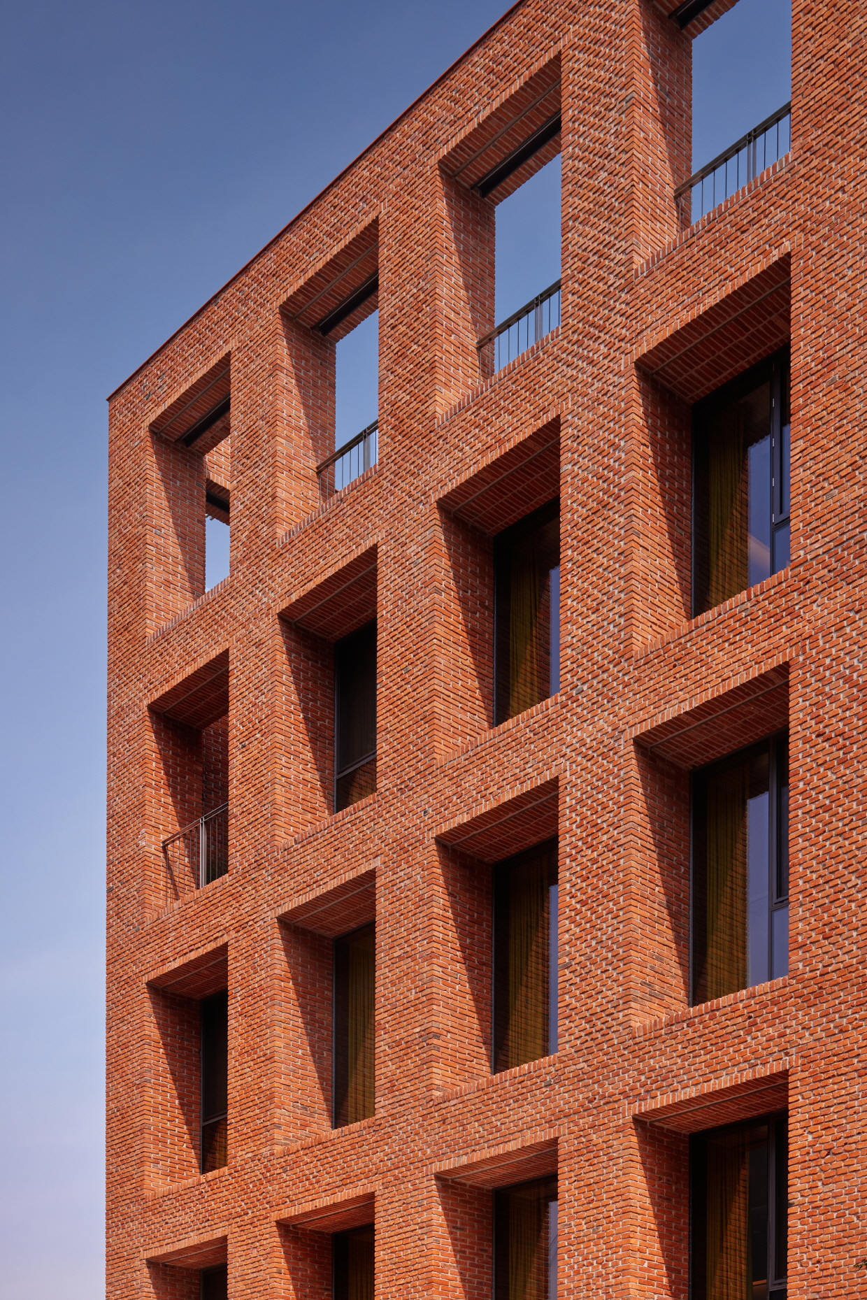
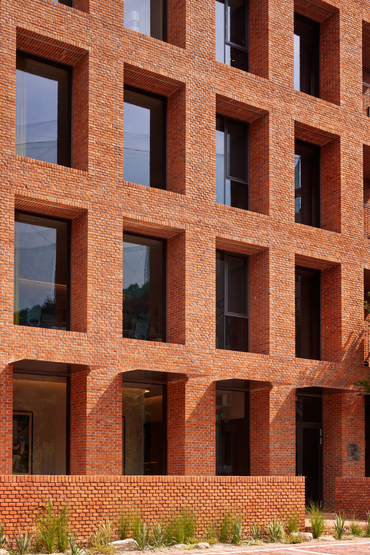
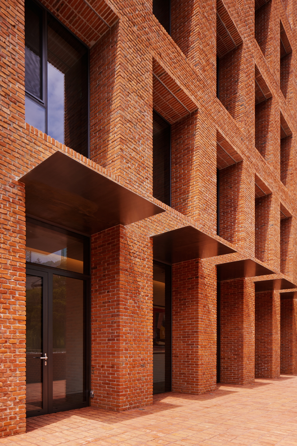
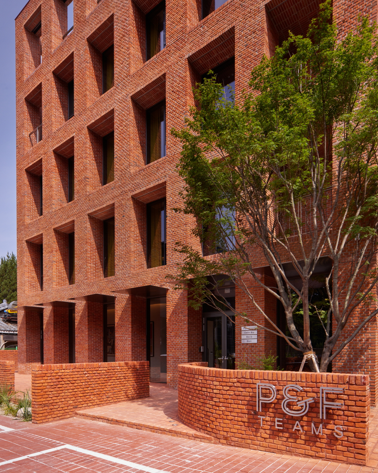
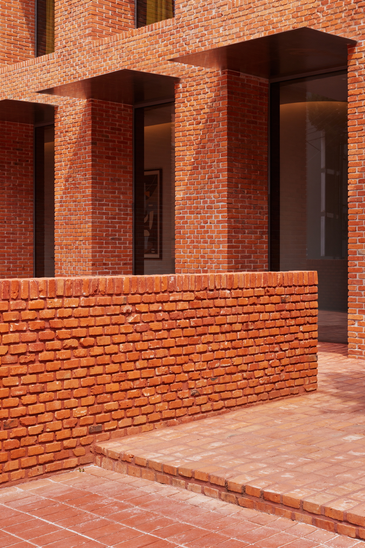
우리는 이 건축이 기업의 사옥으로서 가지는 상징성을 부여하기 위해 의도적으로 정면성에 기인하였다. 이 건물은 하나의 입면, 하나의 메터리얼로 건물 전체에 통일성을 부여해도 될 상황과 맞닿아 있었으며, 입면의 위계질서와 경직된 형태를 흐트러짐 없이 드러내어 고요한 존재감으로 절제된 상징성을 담아내길 바랐다. 우리는 시공성과 디자인을 동시에 고려한 고전적 방식을 현대적으로 해석하여, 완벽히 등분된 입면을 붉은 벽돌이라는 하나의 주제로 풀어나갔다. 특히 정면에는 마구리쌓기를 적용하여 벽돌 한 장 한 장을 쌓아 올리는 정성의 미학이 돋보이도록 벽돌 세그먼트의 크기를 작게 의도했다. 이는 건물에 가까이 다가가 소재가 손에 닿는 순간, 쌓아 올린 정성과 시간의 밀도가 만든 미학의 차이를 온전히 느낄 수 있도록 의도한 것이다.
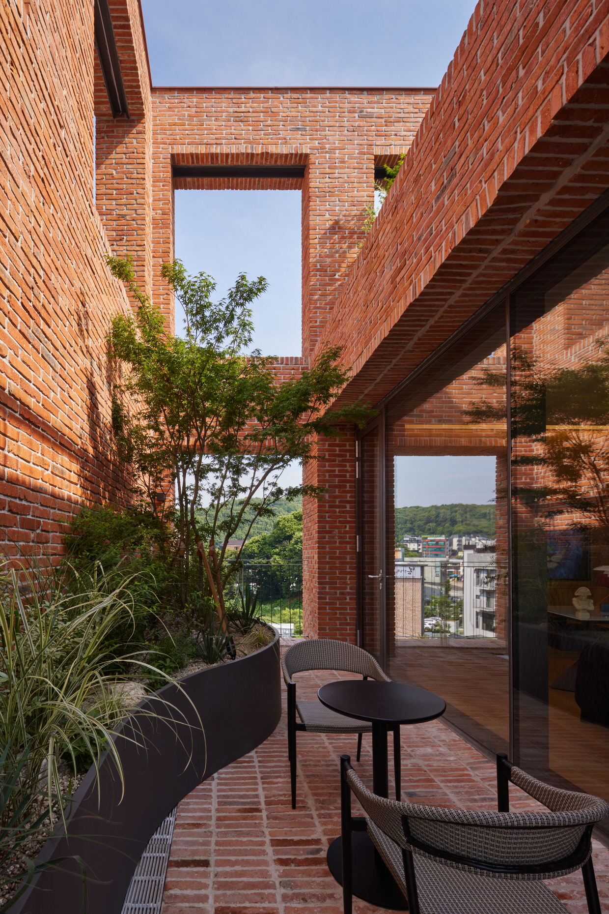
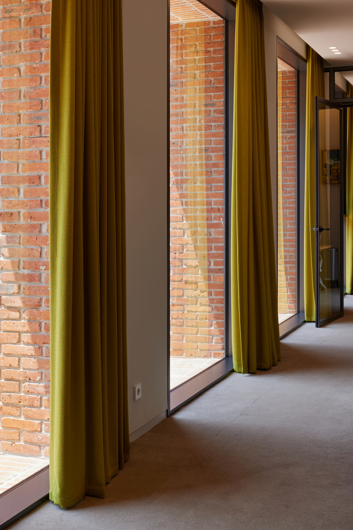
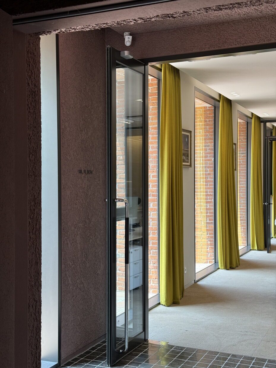
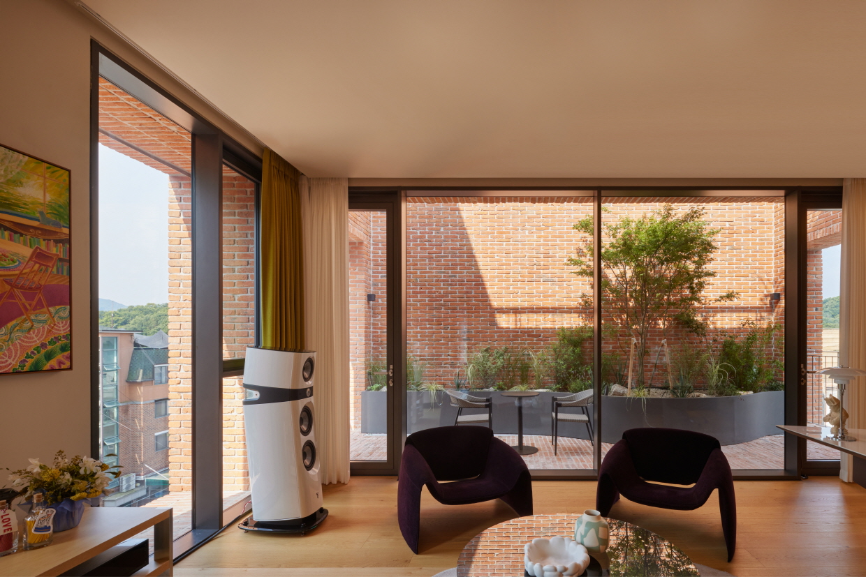
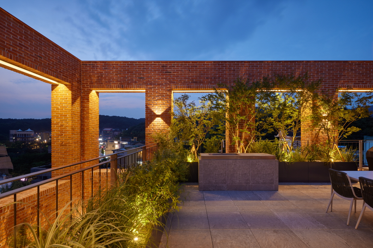
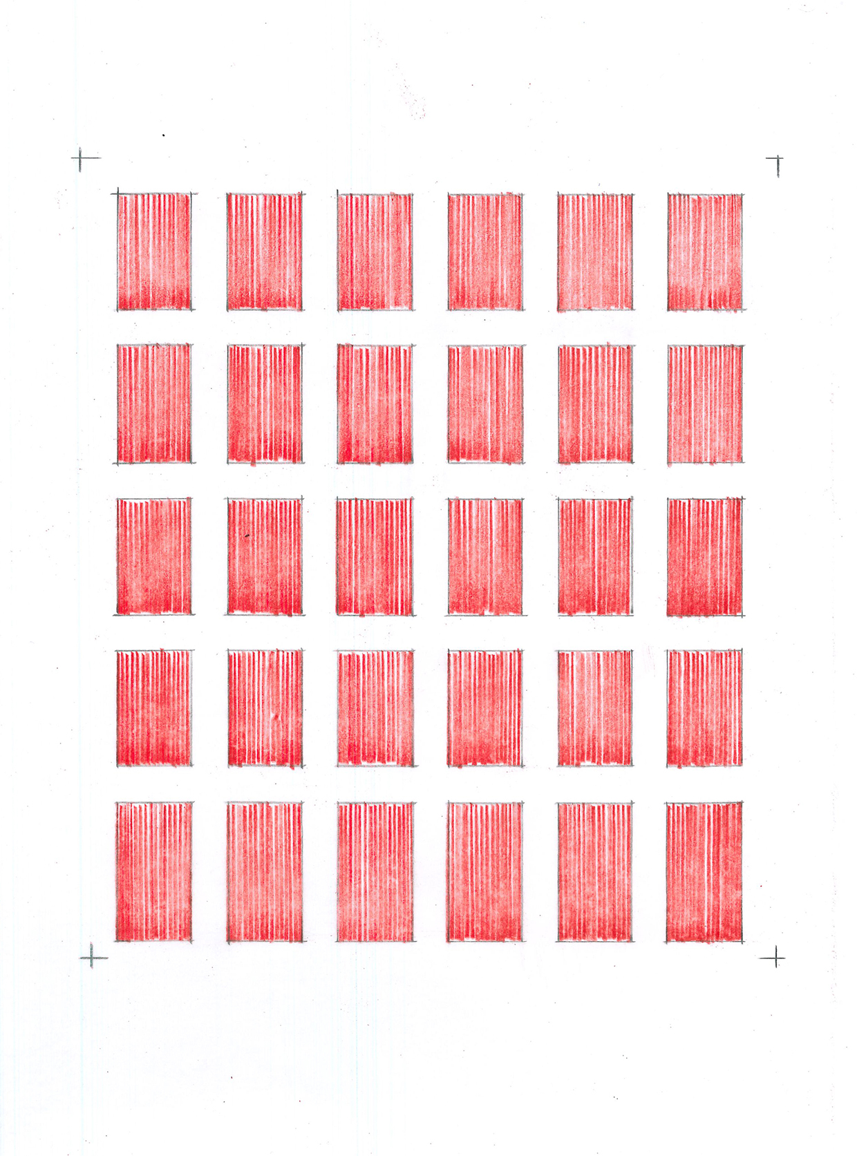
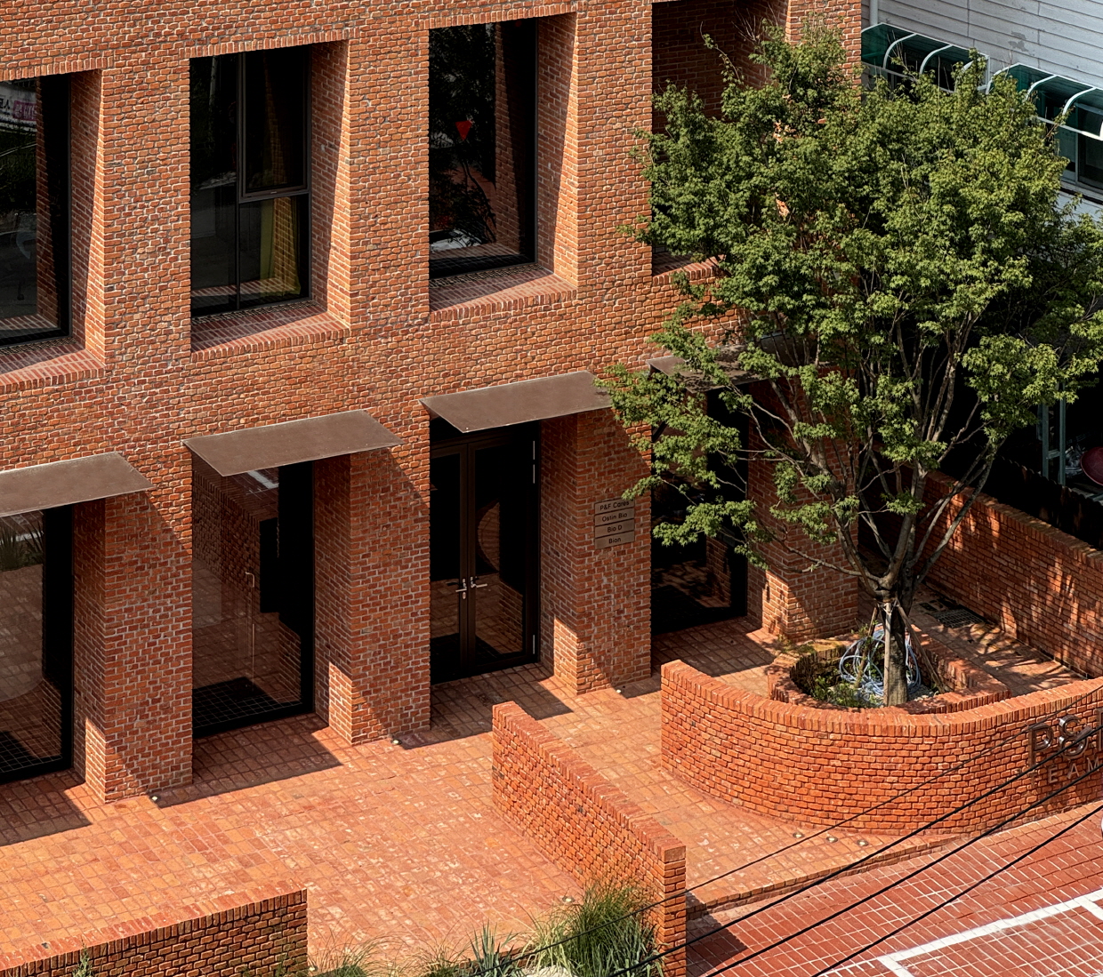
붉은 벽돌로 이루어진 정직한 입면에 서른 개의 개구부(보이드)를 계획했다. 입면은 정확히 여섯 등분하고, 기둥과 보의 폭과 깊이는 모두 900mm로 통일했다. 각 개구부는 가로세로 비율을 황금비(1:1.618)로 설정하고, 파사드의 규칙성이 흐트러지지 않도록 간격을 유지하며 깊이를 부여했다. 일부 보이드는 발코니로 활용해 층마다 직원들이 휴식할 수 있는 공간으로 계획했고, 4층에는 두 개 층 높이의 오픈 테라스를 두어 휴게 공간과 용적률 기준을 함께 만족시켰다. 서른 개의 보이드는 그 자체로 입면의 완결성을 부여하며, 깊이 들어간 창은 남향의 강한 빛을 조절하고 입면에 입체감을 더하는 동시에 내부의 프라이버시 또한 확보해 준다.
Frontality
To impart symbolic presence befitting a corporate headquarters, we deliberately drew upon the concept of frontality. The conditions of this project allowed for the entire building to be unified under a single façade treatment and a single material, enabling a coherent and restrained expression. By revealing the hierarchical order and rigid form of the façade without distortion, we aimed to embody a quiet presence and a measured sense of symbolism. We reinterpreted a classical approach in a contemporary way, balancing constructability and design. The perfectly proportioned façade was developed around a single theme—red brick. On the front elevation, we applied a header bond technique, intentionally using smaller brick segments to highlight the craftsmanship in stacking each brick. This detail was meant to create a tactile experience: when approaching the building closely, one can fully perceive the density of time and care embedded in the masonry.
The honest, red-brick façade was punctuated with thirty openings (voids). The elevation was divided precisely into six equal sections, with all columns and beams set at a uniform 900 mm width and depth. Each opening followed the golden ratio (1 : 1.618) in its proportions, positioned to maintain the façade’s strict regularity while also providing depth. Some voids function as balconies, offering employees spaces for rest on each floor. On the fourth floor, a double-height open terrace serves as both an amenity and a way to meet floor area ratio requirements. These thirty voids complete the façade composition: their recessed windows modulate the intense southern sunlight, add dimensionality to the building’s surface, and preserve privacy for the interiors.

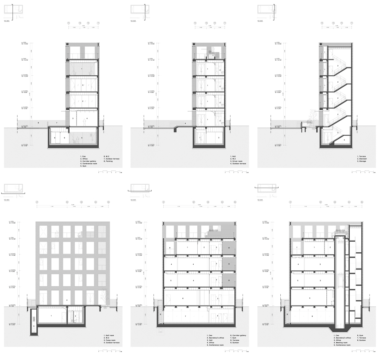

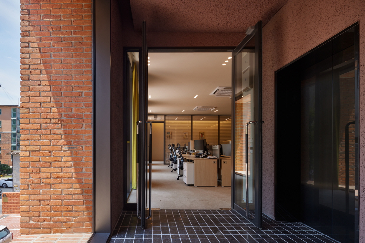
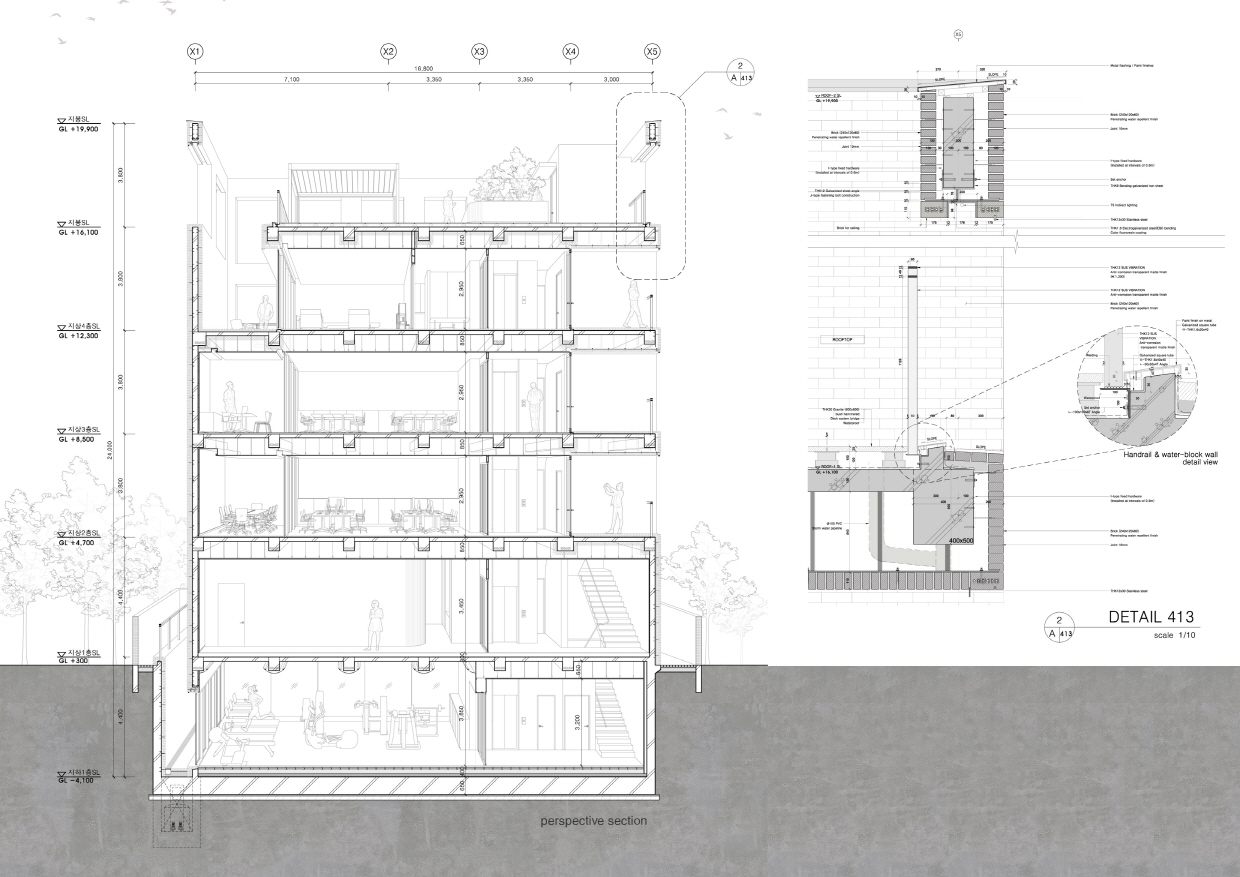
Program
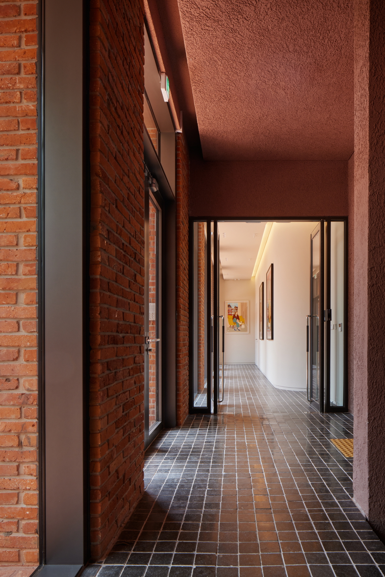
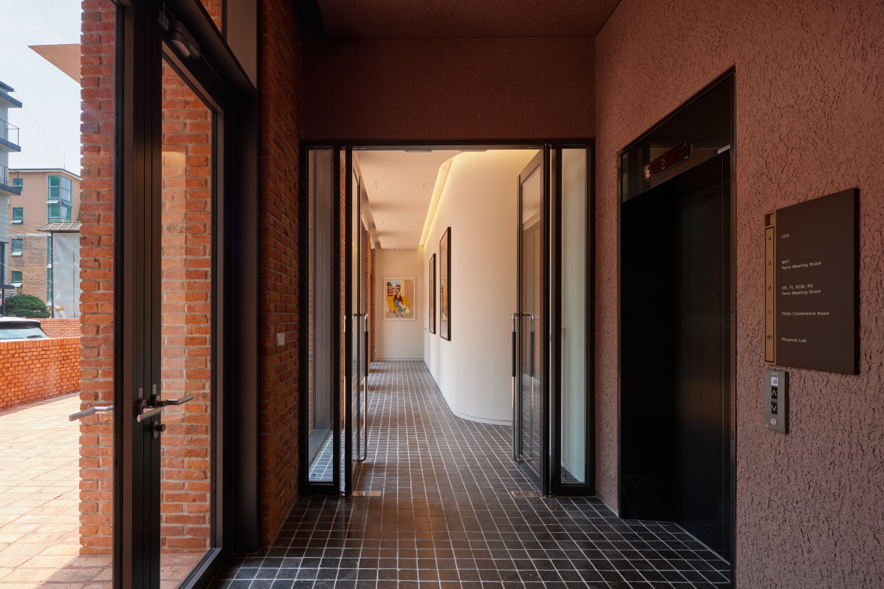
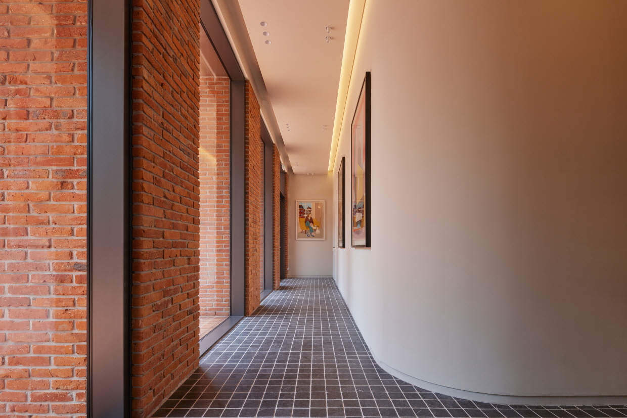
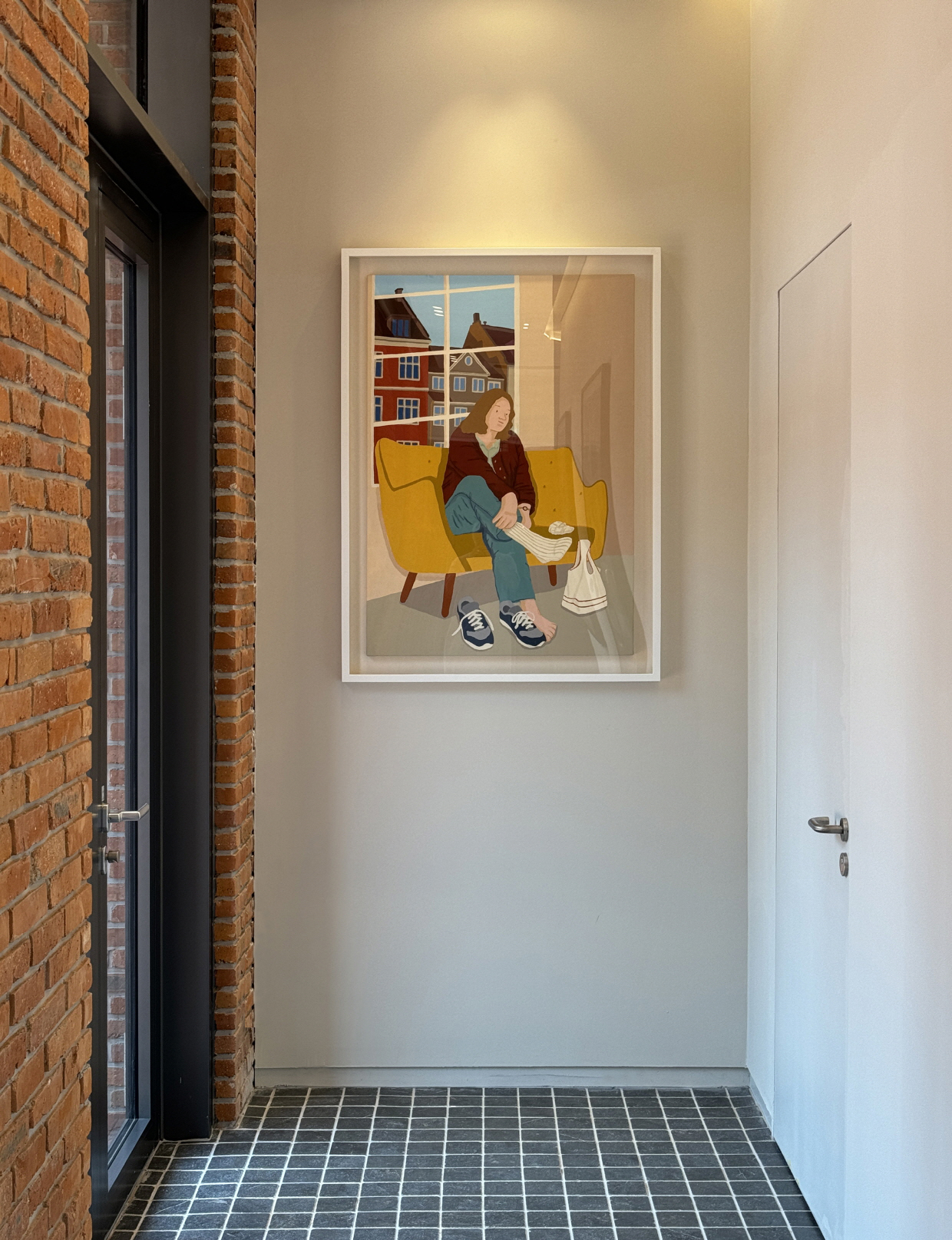
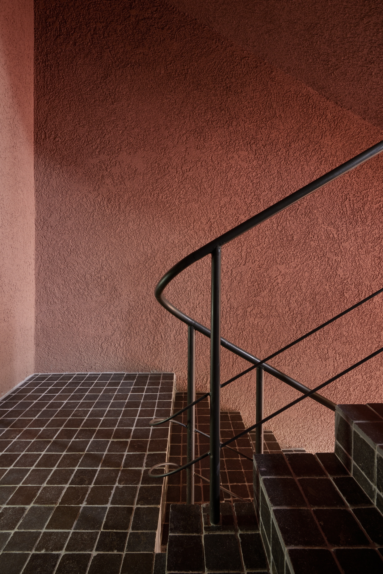
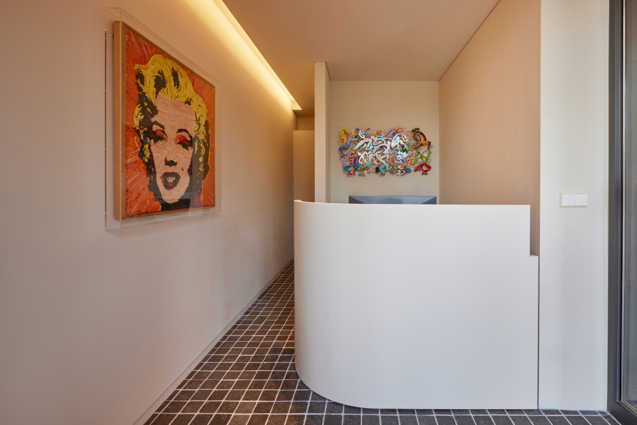
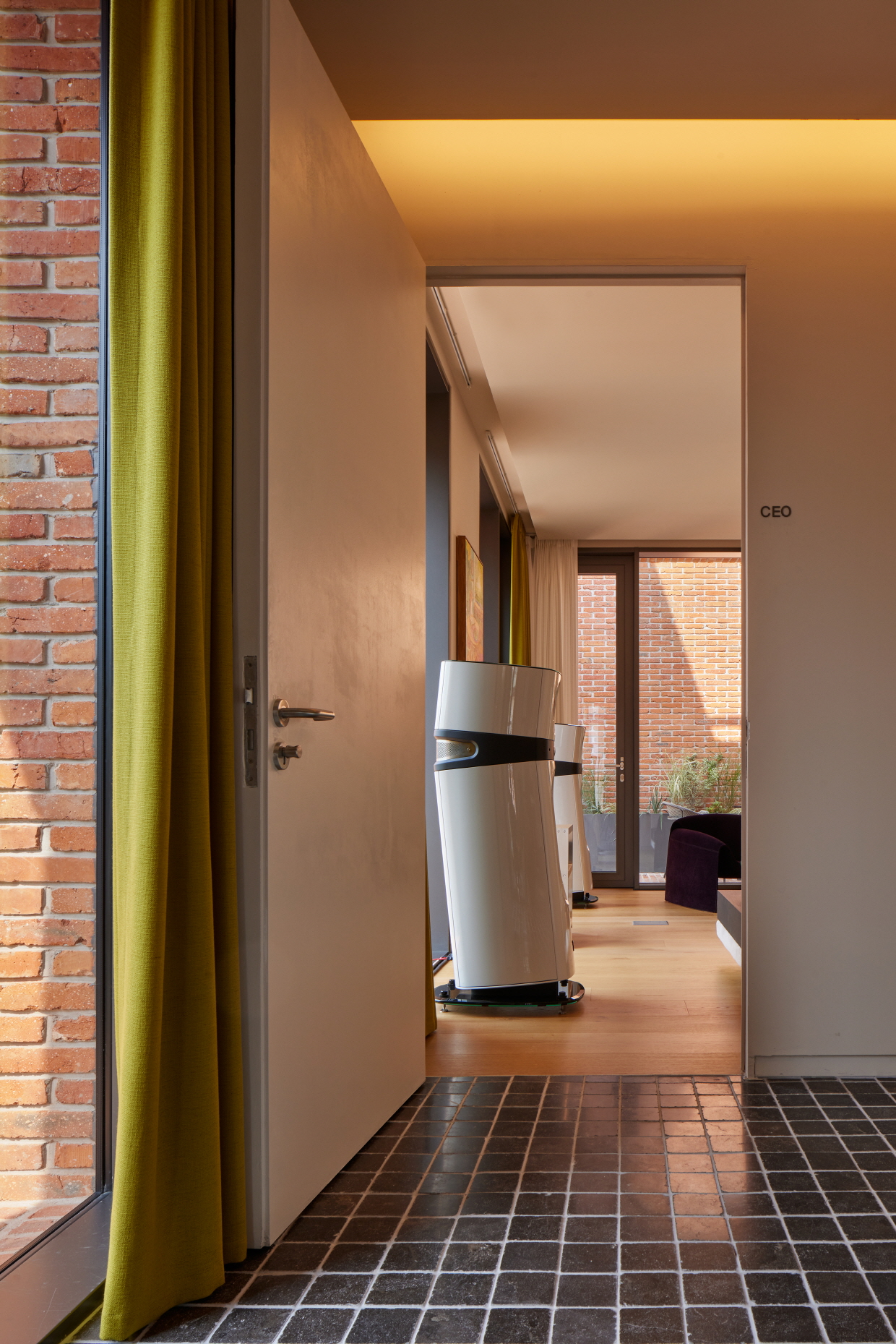
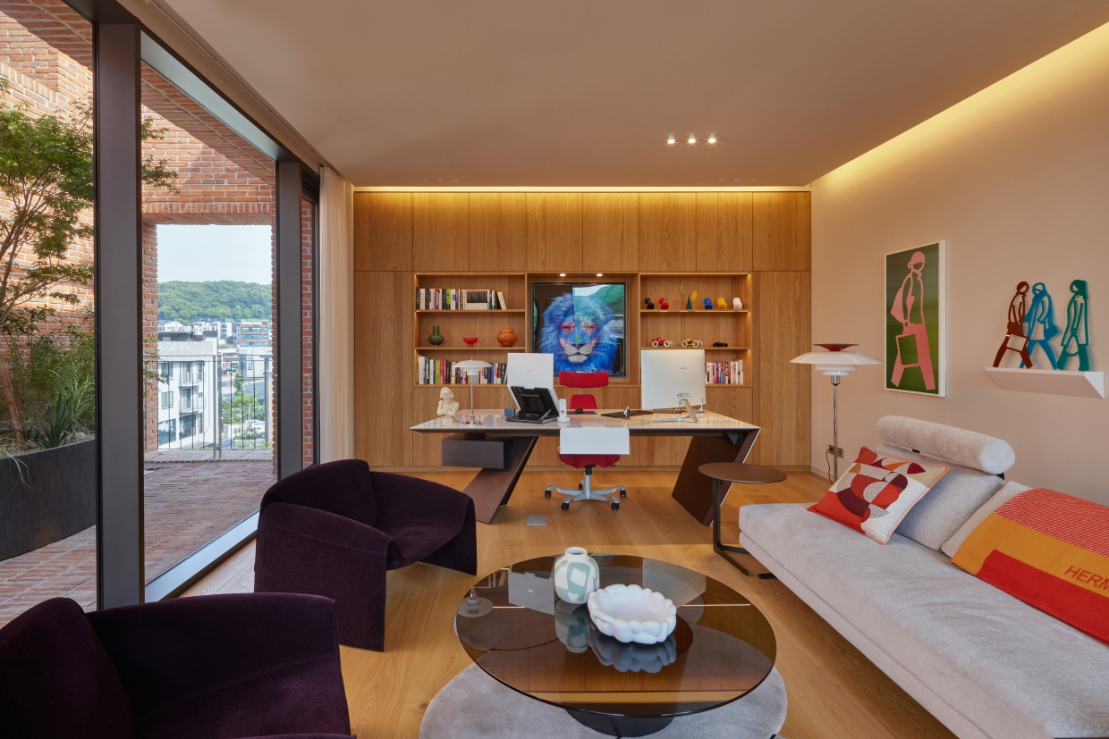
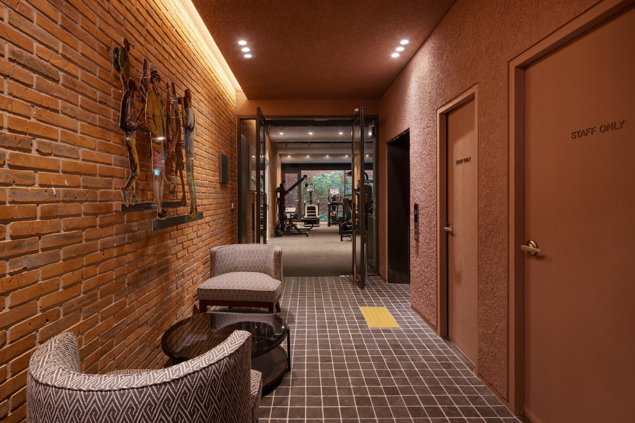
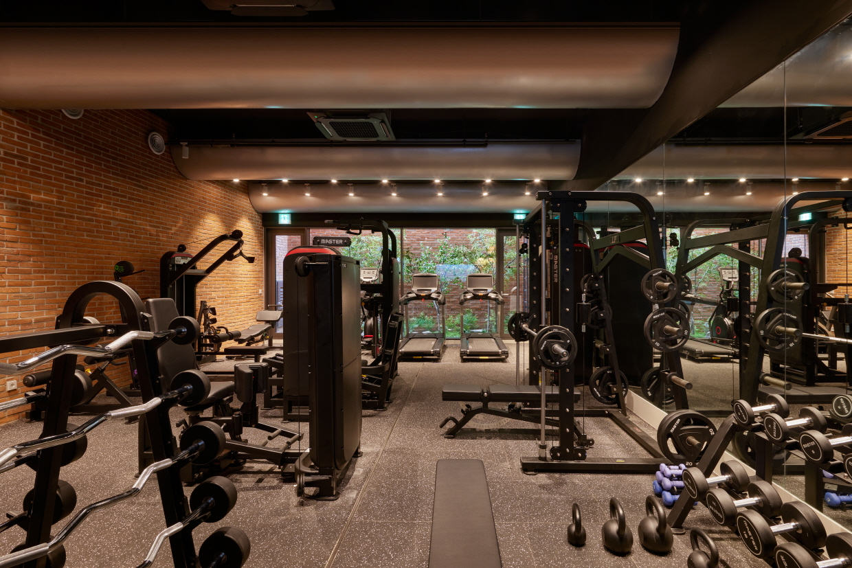
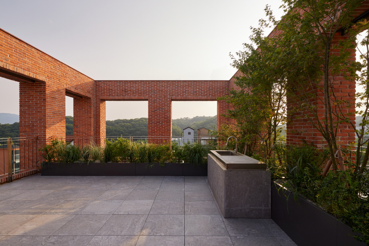
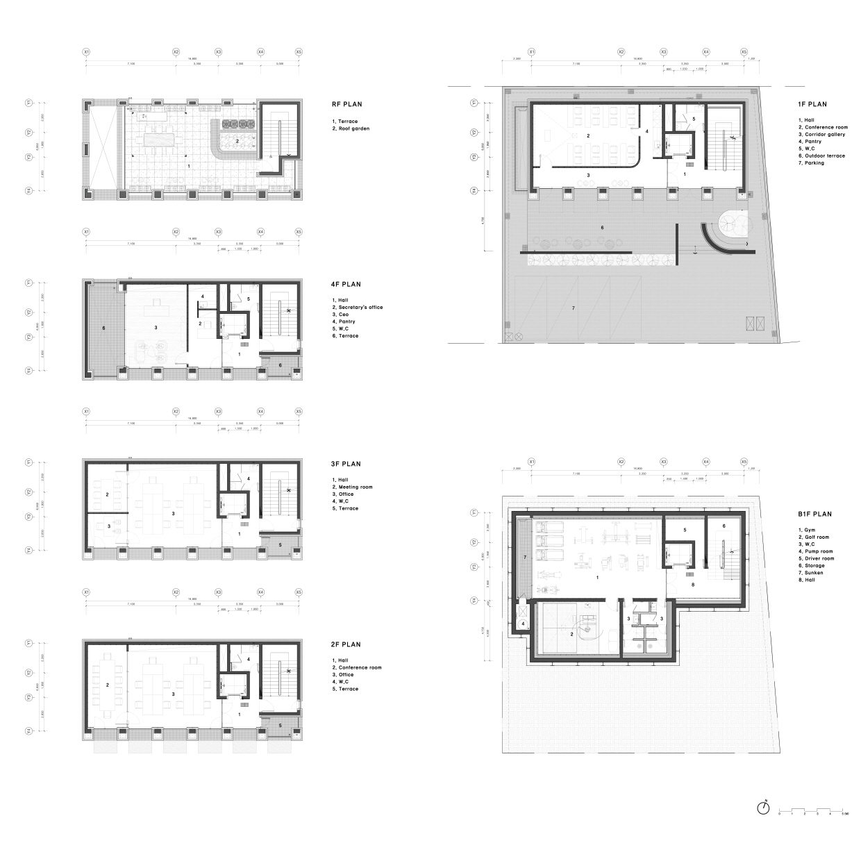
지하층에는 직원 복지를 위한 GYM과 골프 연습실을 배치하고, 1층에는 컨퍼런스룸과 복도형 갤러리를 겸한 공간을 두었다. 옥상은 직원들의 휴식을 위한 옥상 정원으로 계획했으며, 나머지 층은 업무 공간으로 구성되었다.
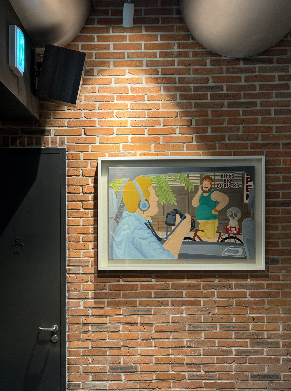
1층 복도형 갤러리는 소기업의 자발적 공공의 역할로 지나는 시민에게 열려있어 누구나 외부에서 그림이나 작품을 감상할 수 있도록 설계했다. 또한 건물은 집약적인 코어설계로 향후 임대를 고려한 일반근생시설로 활용할 수있도록 유연성을 확보했다.
Program
The basement level houses a gym and a golf practice room for employee wellness. The first floor contains a conference room along with a corridor-style gallery space. The rooftop is designed as a garden for employee relaxation, while the remaining floors are dedicated to office use.
The first-floor corridor gallery embodies the company’s voluntary public role as a small business, remaining open to passersby so that anyone can view paintings or artworks from outside. Additionally, the building’s compact core layout provides flexibility for future use as a general neighborhood facility, allowing for potential leasing opportunities.
장면성을 짓는 일
바라보는 시점, 동선, 경험이 각기 다른 조건에서 마주하게 될 장면을 예측하고, 절제된 질서와 조율을 통해 건축을 구축하고, 그 공간이 하나의 ‘장면’처럼 구성되어, 특정한 감정이나 분위기, 의미를 만들어 내길 기대했다.
건축은 단순히 조형성에 머물지 않고, 우리가 만지고 느끼며 체험하는 모든 감각과 연결되어야 한다. 멀리서 인지되는 형태부터, 가까이서 손끝에 닿는 재료의 감촉까지. 안과 밖의 경계가 이분법으로 구분되지 않고, 하나의 서사로 연속되게 하는 것. 좋은 건축은 잘 짜여진 영화의 시놉시스처럼, 건축가의 의도가 분명하게 읽혀야 한다. 단순해 보이지만 정제된 비례와 깊이, 빛과 재료, 동선까지 세심하게 조율된 공간은 하나둘 모여 건축의 표정을 만든다.
정직하게 나누어 놓아 어쩌면 공허한 표정과 몸짓. 비틀거나 둥글려서 시선을 끌기 위한 조형적 유혹을 참아낸 절제. 비례와 반복의 힘이 장식적 위트보다 더 큰 울림을 준다고 믿는다. 참을 수 없는 욕망의 가벼운 선들보다, 꾹 눌러 참아낸 인내의 선이 더 큰 깊이를 만들어 내기를.
건축은 표상이 아니라, 기능하는 기계로 작동되어야 한다.
단지 아름다운 형식을 그려내는 데 그치지 않고, 치밀한 기능과 지속성의 토대 위에 비로소 설득력을 얻는다.
Composing Scenes
We sought to anticipate the scenes that would emerge from different viewpoints, paths, and experiential conditions—building the architecture through restrained order and careful coordination—so that each space would be composed like a single scene, evoking a particular emotion, atmosphere, or meaning.
Architecture should not remain solely in the realm of form; it must connect to all the senses through which we touch, feel, and experience it—from the shape perceived at a distance to the texture of materials felt at one’s fingertips. The boundary between inside and outside should not be a rigid division, but a continuous narrative. Like the synopsis of a well-crafted film, good architecture should make the architect’s intent clearly legible. Spaces that appear simple yet are finely tuned in proportion, depth, light, material, and circulation gradually come together to form the building’s expression.
We embraced an honest division of elements, even if it yielded an austere expression and gesture—resisting the temptation to twist or curve forms for visual allure. We believe the power of proportion and repetition resonates more deeply than ornamental wit. The lines born of patient restraint, rather than those drawn from an irresistible desire for embellishment, yield greater depth.
Architecture is not a mere representation; it must operate as a functional machine.
Its persuasiveness lies not just in producing beautiful forms, but in resting upon a foundation of precise functionality and enduring sustainability.
건축, 본질적 가치의 구현
우리는 건축이 물리적 기능을 넘어, 상징이 되는 방식으로 작동되길 바랐다. 하나의 입면, 하나의 재료, 반복되는 창은 질서의 언어로 건축의 태도와 시간성을 담아낸다. 이는 건축이 시대를 초월하고 본질에 가까워지기 위한 방법이며, 기교나 과잉 대신 절제된 구성 속에서 질서와 깊이를 통해 감각과 시간의 결을 담아내기 위함에 있다.
Architecture — Embodying Essential Value
We envisioned architecture that functions not only in a physical sense but also as a symbol. A single façade, a single material, and a rhythm of repeating windows express an architectural attitude and a sense of time through the language of order. This approach offers a way for architecture to transcend its era and move closer to its essence—capturing the texture of sensation and the passage of time not through flourish or excess, but through a restrained composition in which order and depth prevail.