

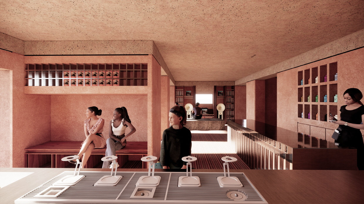
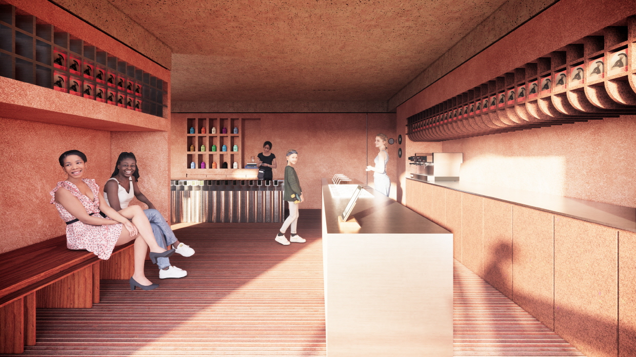
이번 프로젝트에서 중요하게 생각했던 점은. 바로 “감도”이다. 영어로는 “vibe” 정도 되려나? 좀더 격식있게 표현하자면 “atmosphere”.
최근 디자인 미팅을 하노라면 흔하게들 “감도가 좋다, 감도가 약하다” 라는 말을 많이 듣게 된다. 언제부터 이 단어를 많이들 쓰는지 모르겠지만,,내게 느껴지는 이 감도라는 표현은 건축에서 형태나 공간의 구조, 혹은 뼈대 등은 아니고, 소재의 질감이나 색감등 촉감각적이나 시청각, 혹은 후각등과 더 가깝다. 공간의 분위기나 무드가 형태 지향적인 흐름을 따라가다가(보다 과격하고, 보다 선굵은 매싱등) 이제는 점차 형태는 단순해지고 질감과 소재등으로 넘어가는 추세인 것 같다. 벽에 페인트칠을 하더라도, 단순한 컬러결정이 아니라, 그 질감에 더욱 포커싱을 둔다. 던에드워드, 벤자민무어등의 고급도료가 조금 식상해지고, 발페인트, sto 등의 질감 표현에 유리한 도료가 선호도가 있다. 그만큼 일반 대중의 공간을 소비하는 “감도”가 높아진 것이라 할 수 있다. 물론 그 시공 가격을 듣는 순간 “다음기회에..”가 될 수 있지만.
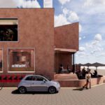
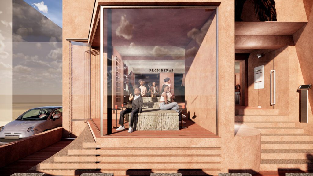
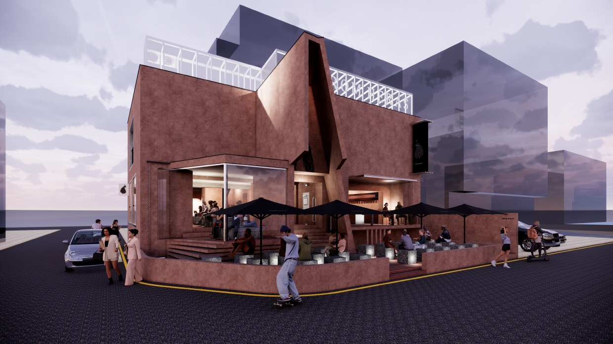
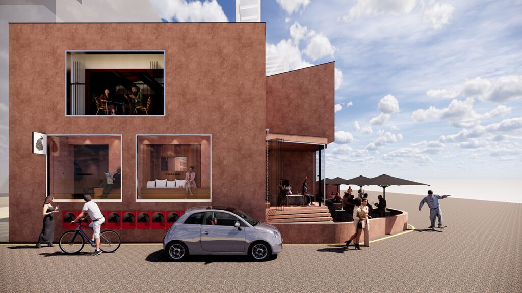
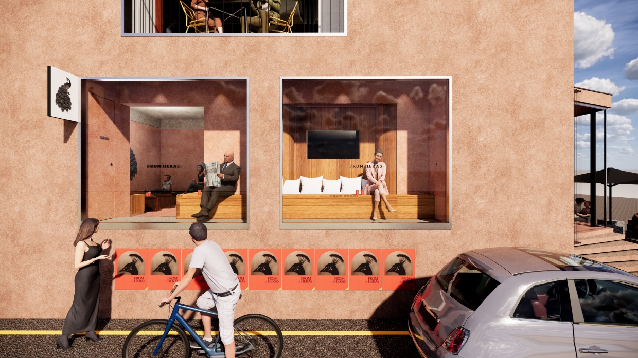
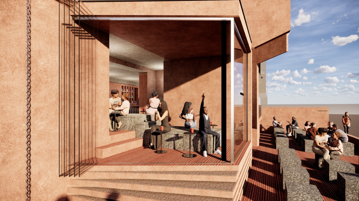
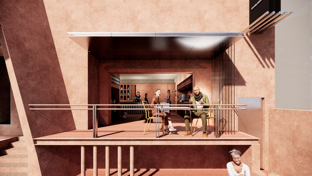
이번 작업이 리모델링 프로젝트였던 만큼, 맘에 들지 않다고 모두 철거 할 순 없으니 기존 구조나 형태는 유지하고(워낙에 조형성이 강한 건물이었다) 가능하면 메타리얼의 질감과 톤의 변화등을 통해 기존 가지고 있던 조형성을 무력화 시키고, 공간에 집중 시키고자 했다. 이미 오랫동안 같은모습으로 비어 있던 건물이라 그 자체로 긴세월 노출되었고, 외부는 그대로 둔채 내부만 바꿔서는 임팩트가 약할 것으로 보았다. (물론 브랜드의 네임드나 포지션에 따라 다르겠지만) 그대로 연속성을 가져가기 보다 약간의 신선한 변화를 꽤하고, 기존 브랜드의 메타포를 이어 오는게 이번 프로젝트의 키포인트로 나는 보았다.
The key aspect we focused on in this project was “sensitivity.” In English, it might be roughly expressed as “vibe,” or more formally as “atmosphere.”
In recent design meetings, I often hear people say that a space has “good sensitivity” or “weak sensitivity.” I’m not sure when this term started to gain popularity, but the way I perceive it, “sensitivity” in architecture isn’t about the form, spatial structure, or framework. Rather, it relates more closely to tactile, visual, auditory, or even olfactory experiences—such as the texture of materials or the nuances of color. The trend seems to be that while the spatial atmosphere or mood used to follow a more form-driven direction—bolder, more aggressive massing—it is now gradually shifting toward simplicity in form, emphasizing materiality and texture instead. Even when painting a wall, the focus is not merely on color selection but more on the texture itself. Premium paints like Dunn-Edwards or Benjamin Moore have become somewhat conventional, while materials and paints that better express texture, such as Bal Paint or Sto, are gaining preference. This reflects a growing “sensitivity” among the general public in how they experience spaces. Of course, hearing the cost of such finishes might make one think, “maybe next time,” but the preference is clear.
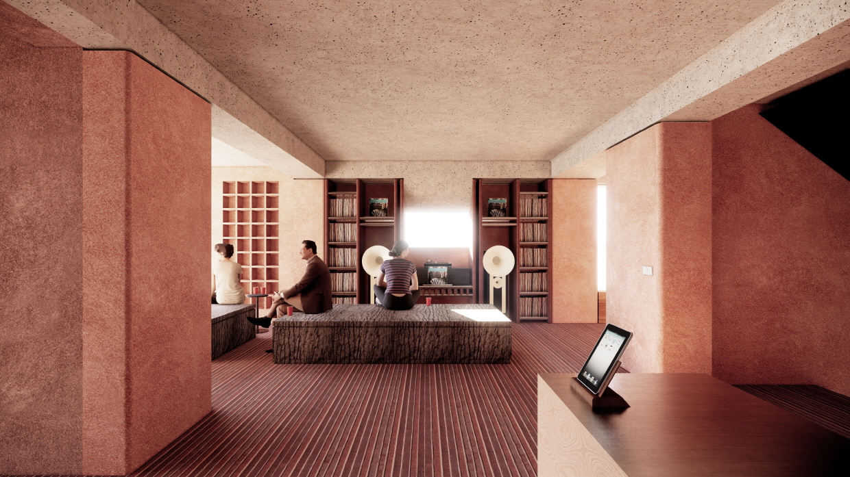
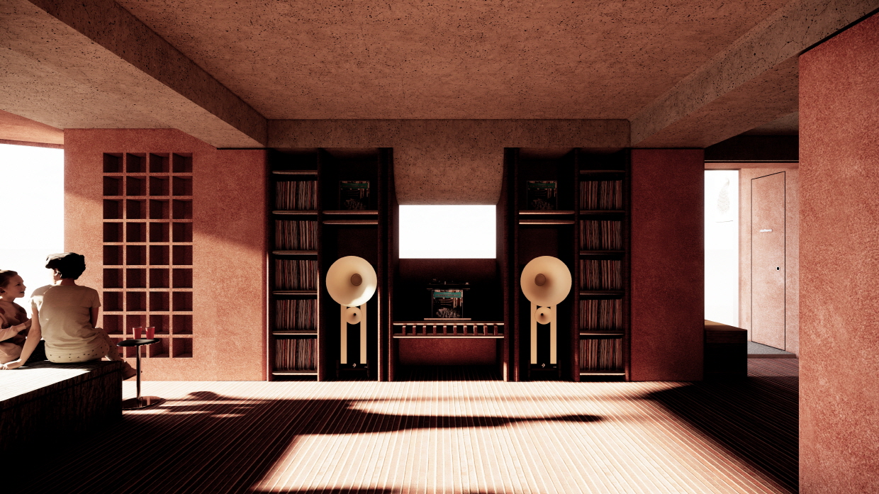
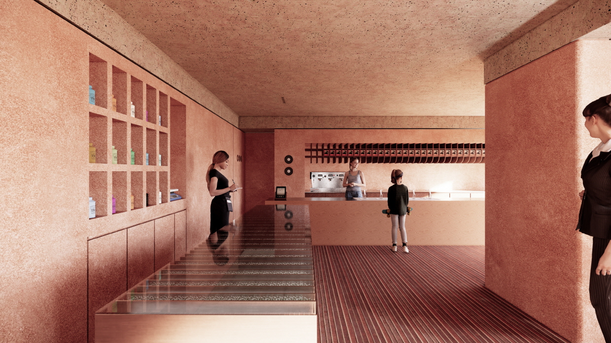
Since this project was a remodeling rather than a new build, we couldn’t simply demolish everything we didn’t like. The existing structure and form had to be maintained—especially given the strong sculptural character of the building—but wherever possible, we sought to neutralize the original sculptural presence and shift focus onto the space itself through changes in material texture and tonal variation. The building had stood empty for a long time, exposed to the passage of time, so altering only the interior without addressing the external context would likely have little impact. (Of course, this can vary depending on the brand’s name or positioning.) Rather than maintaining absolute continuity, I saw the key point of this project as introducing a subtle, refreshing change while continuing the metaphoric language of the existing brand.
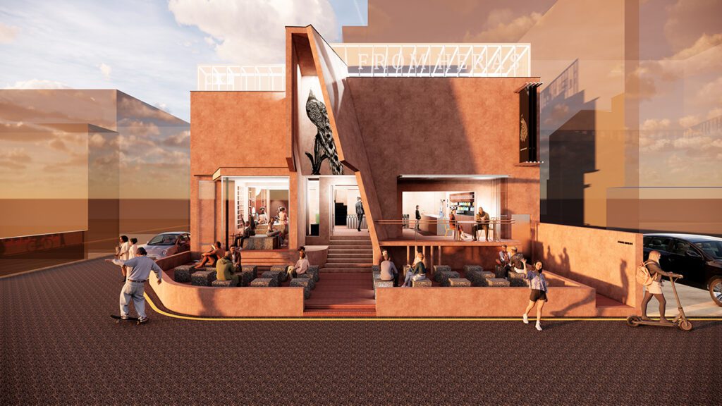
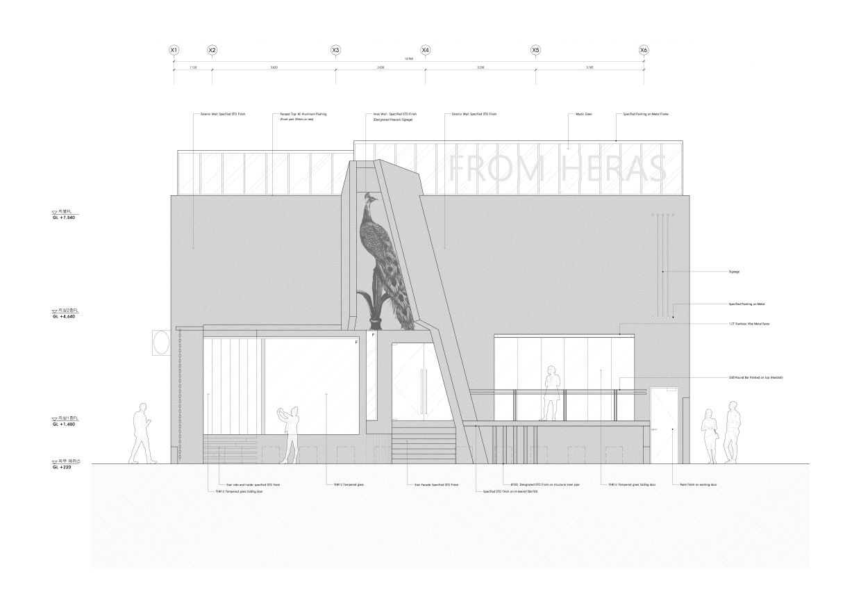
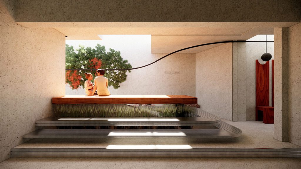
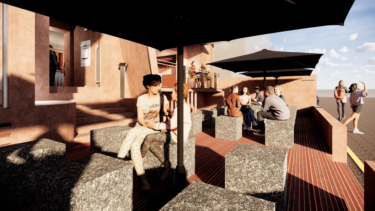
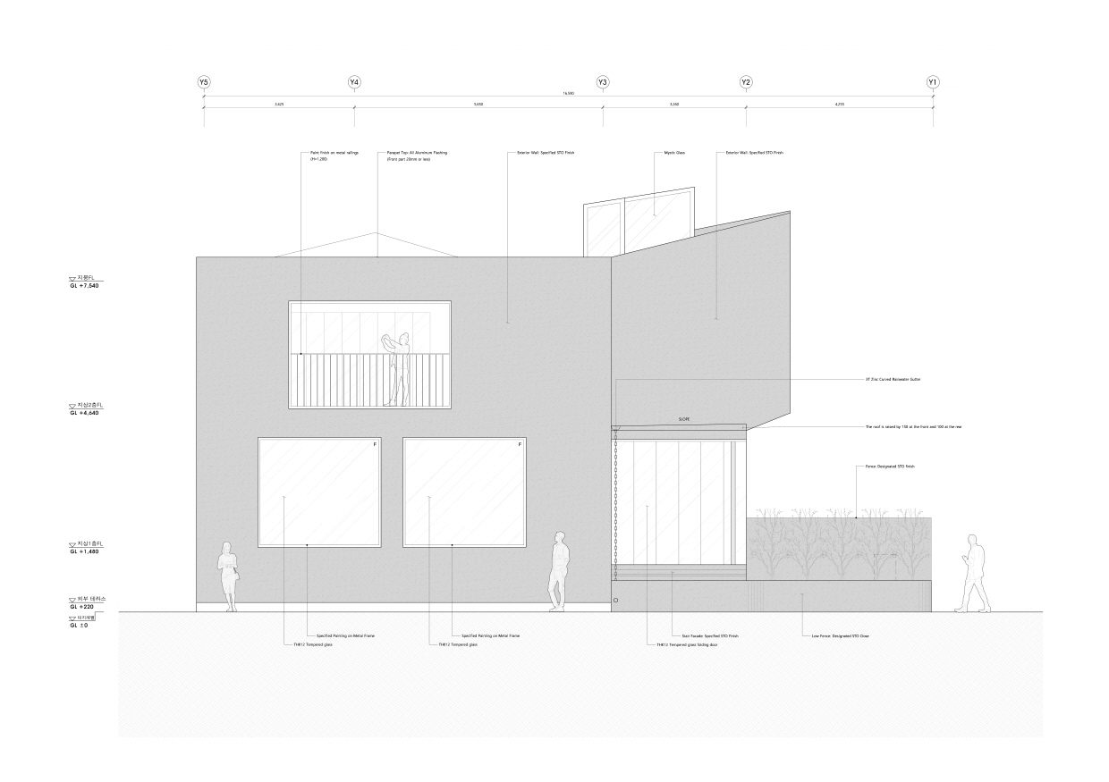
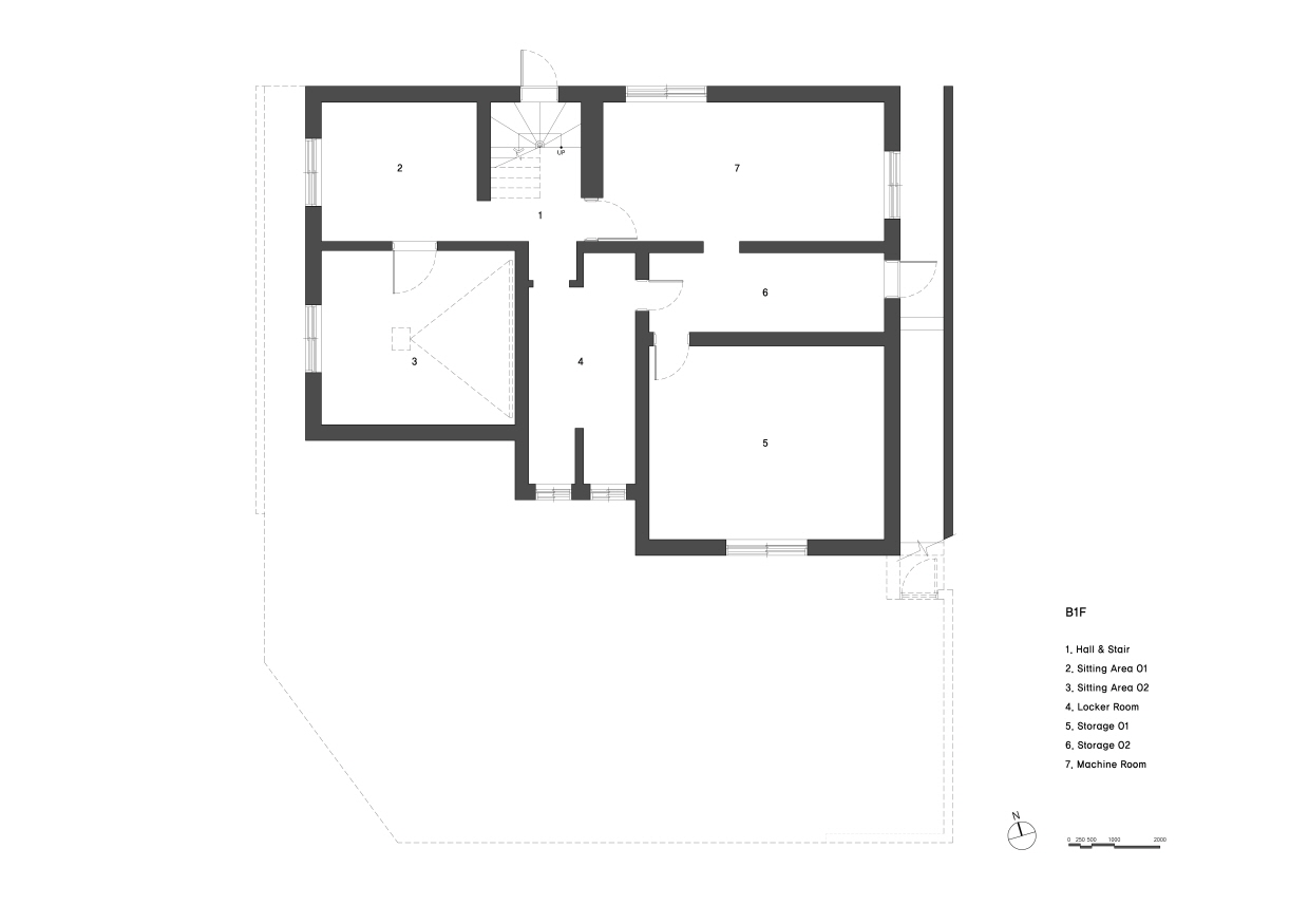
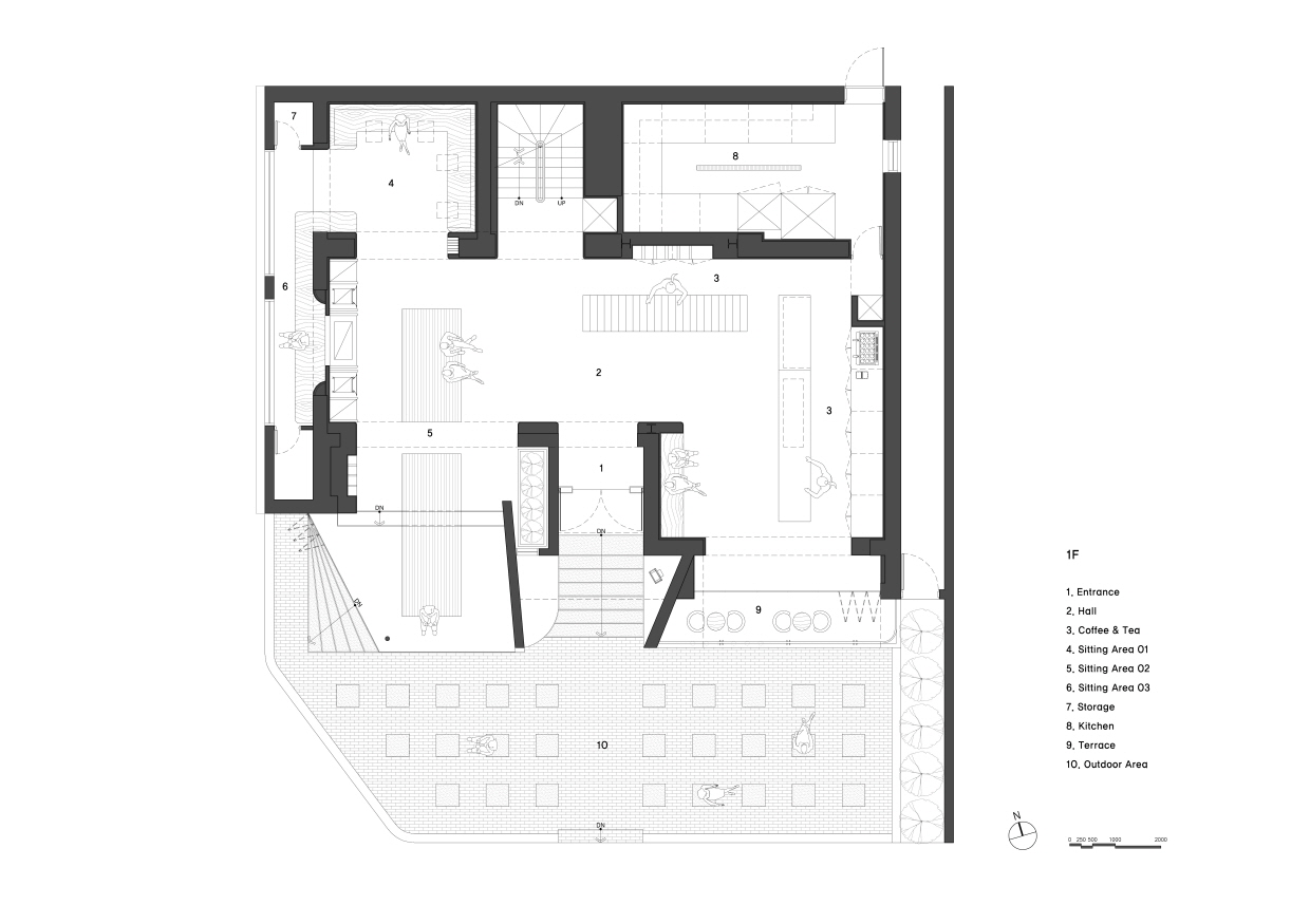
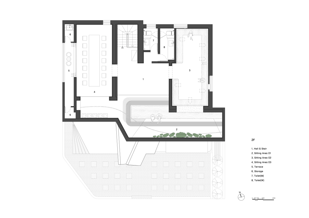
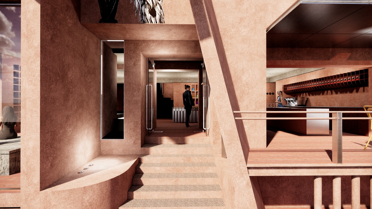
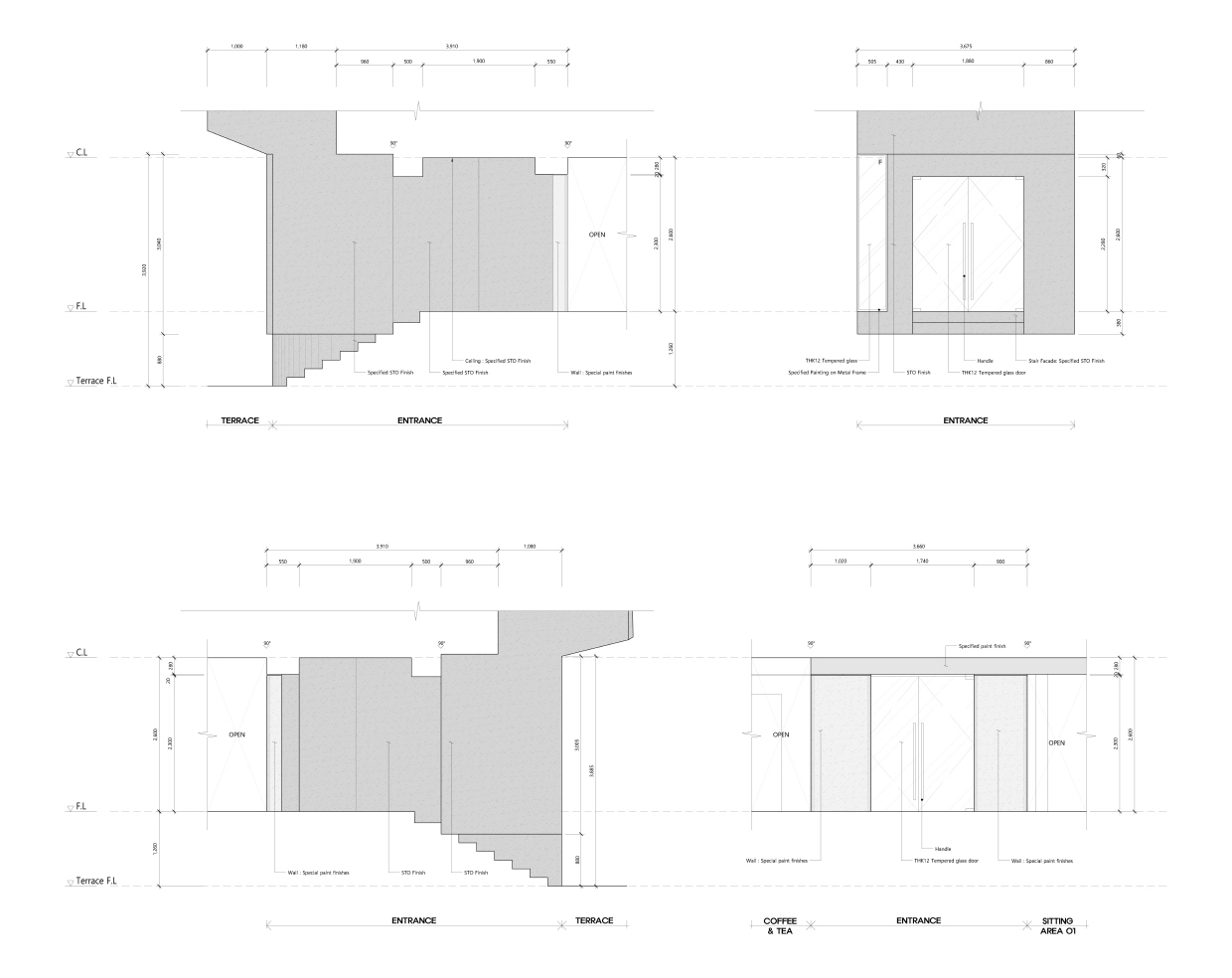
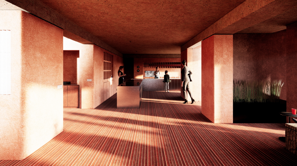
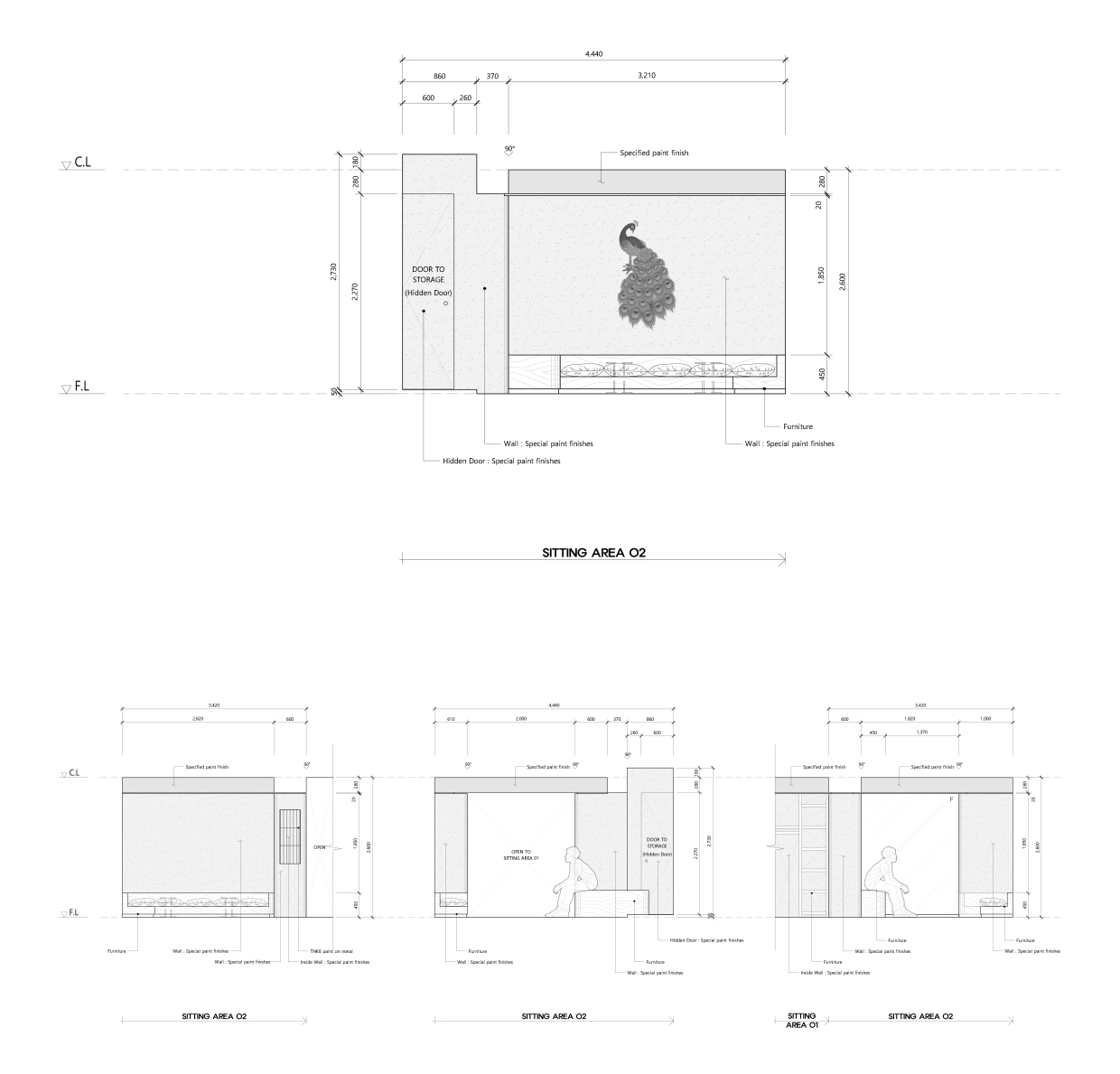
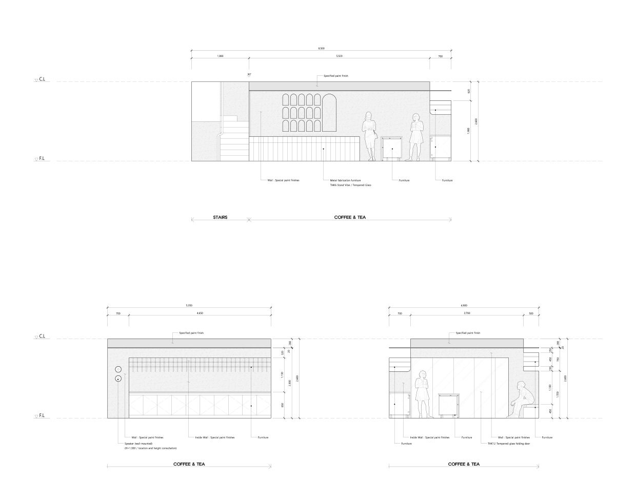
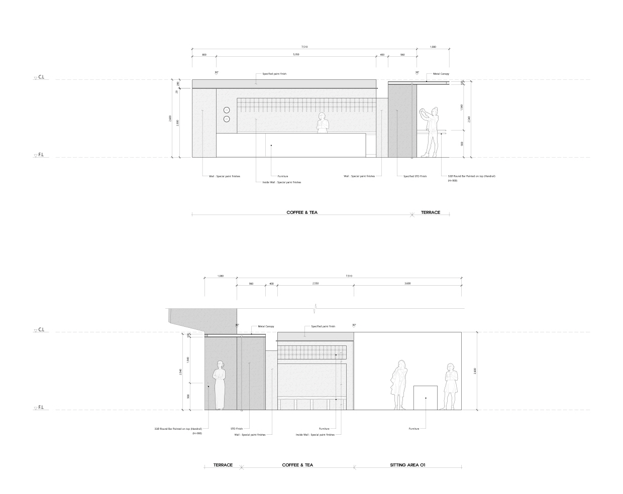
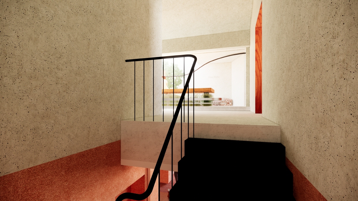
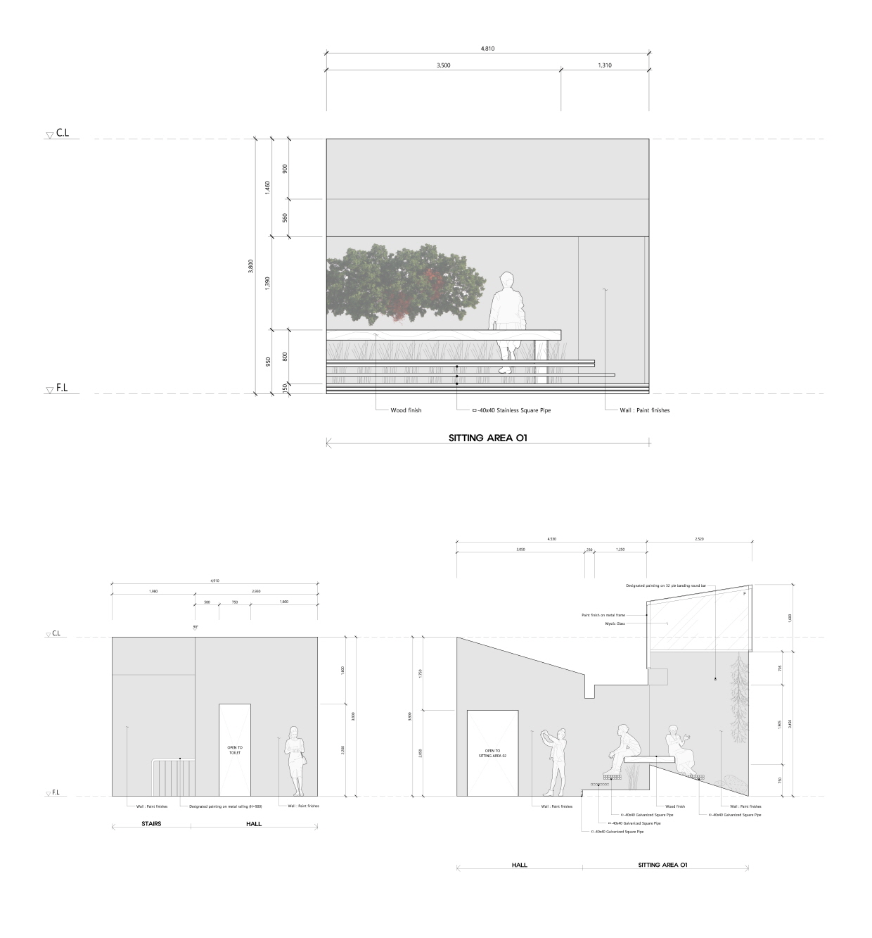
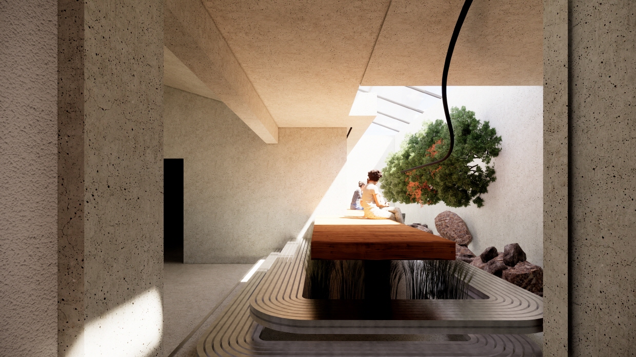
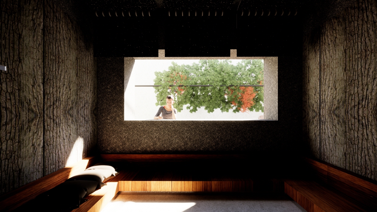
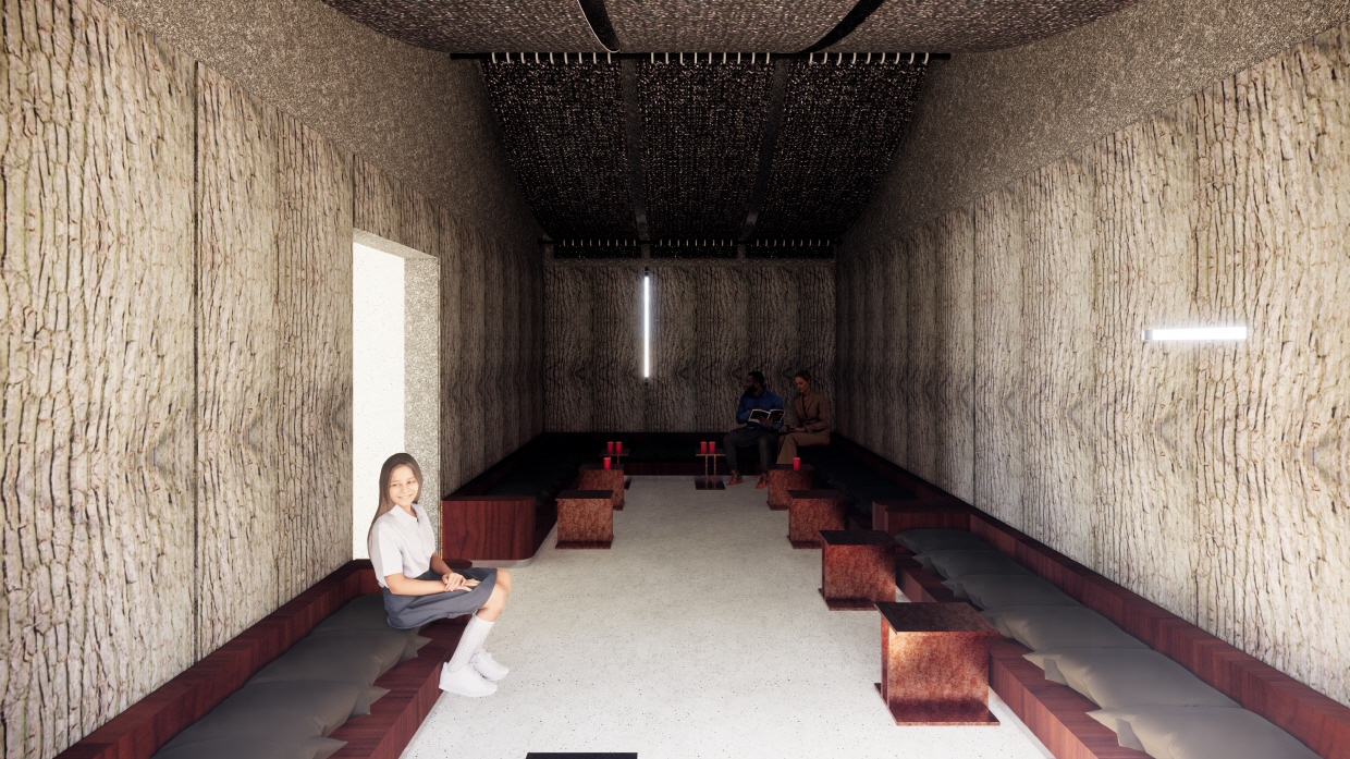
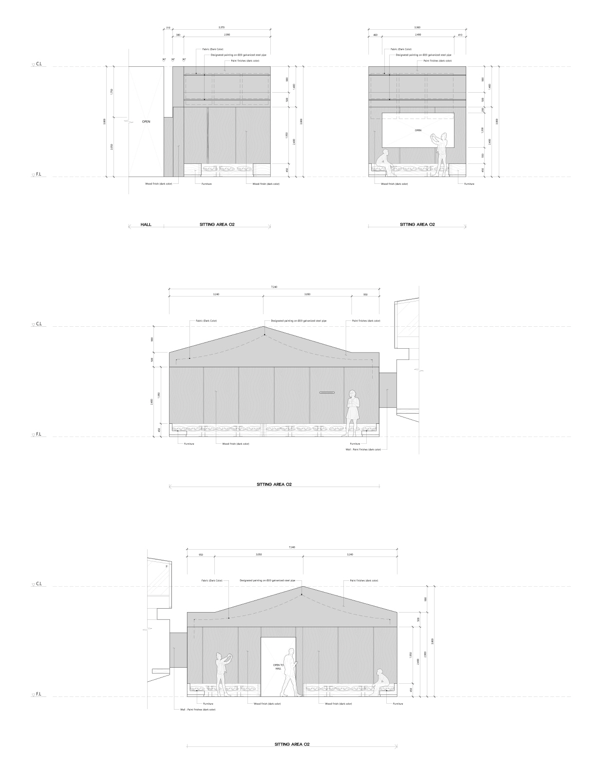
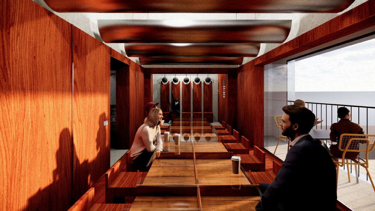
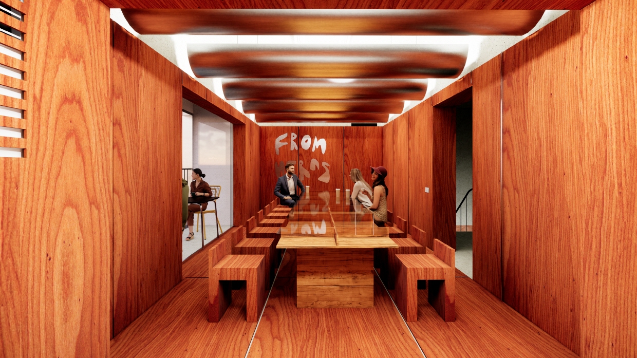
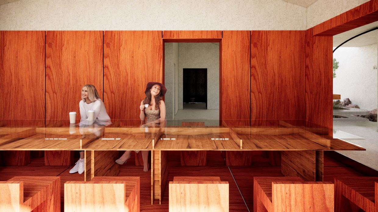
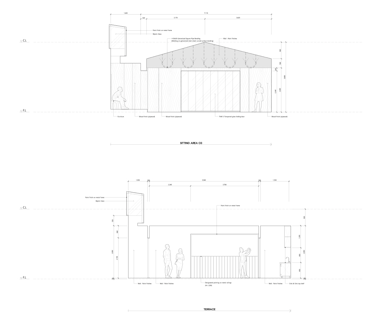
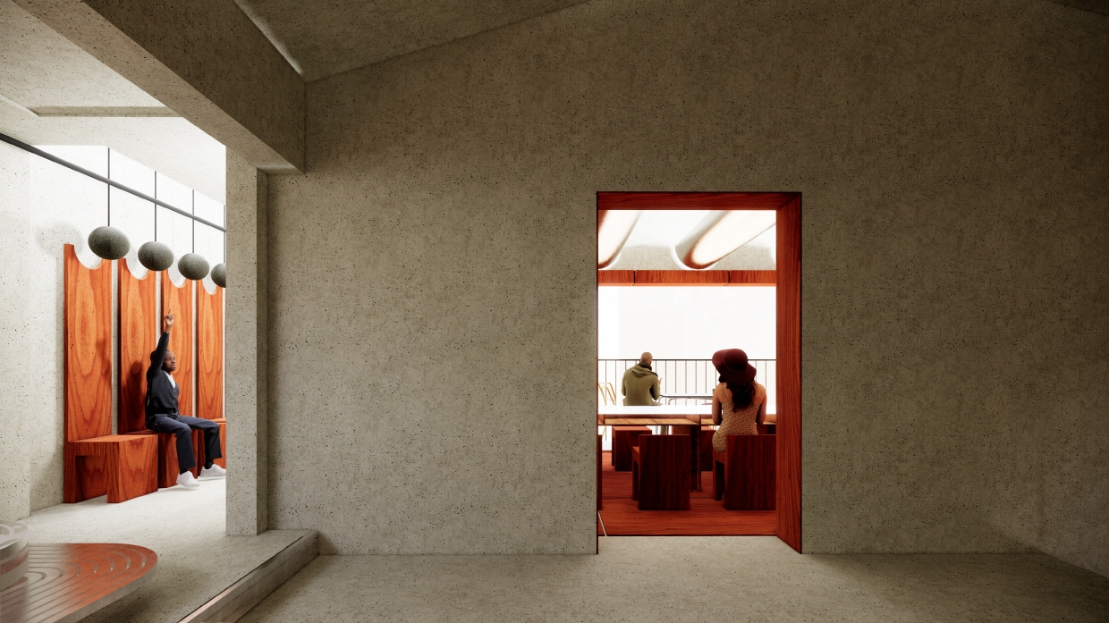
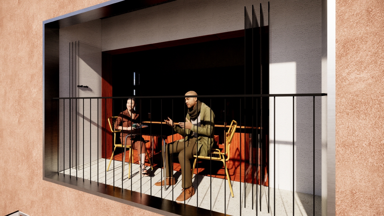
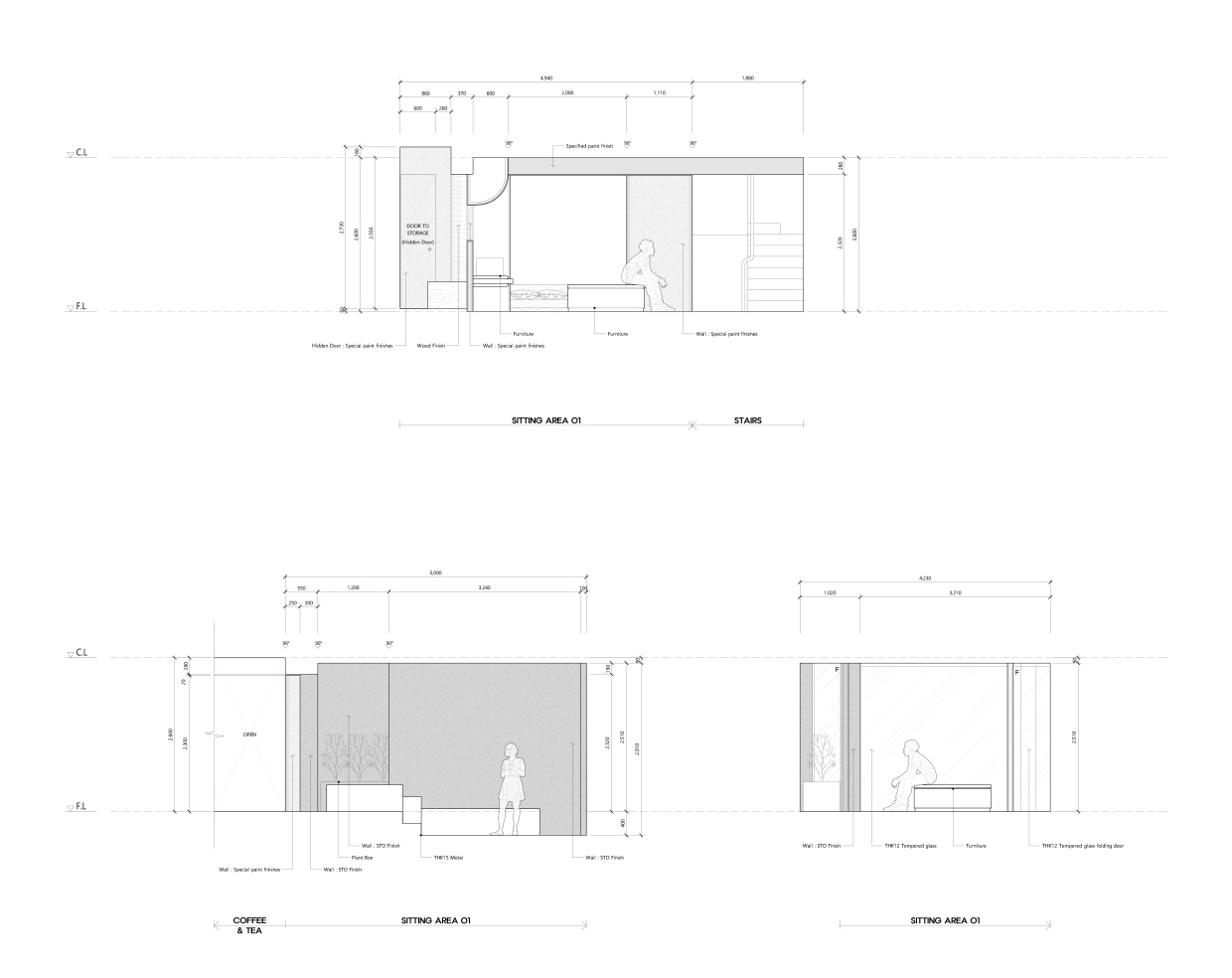
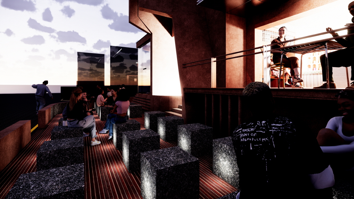
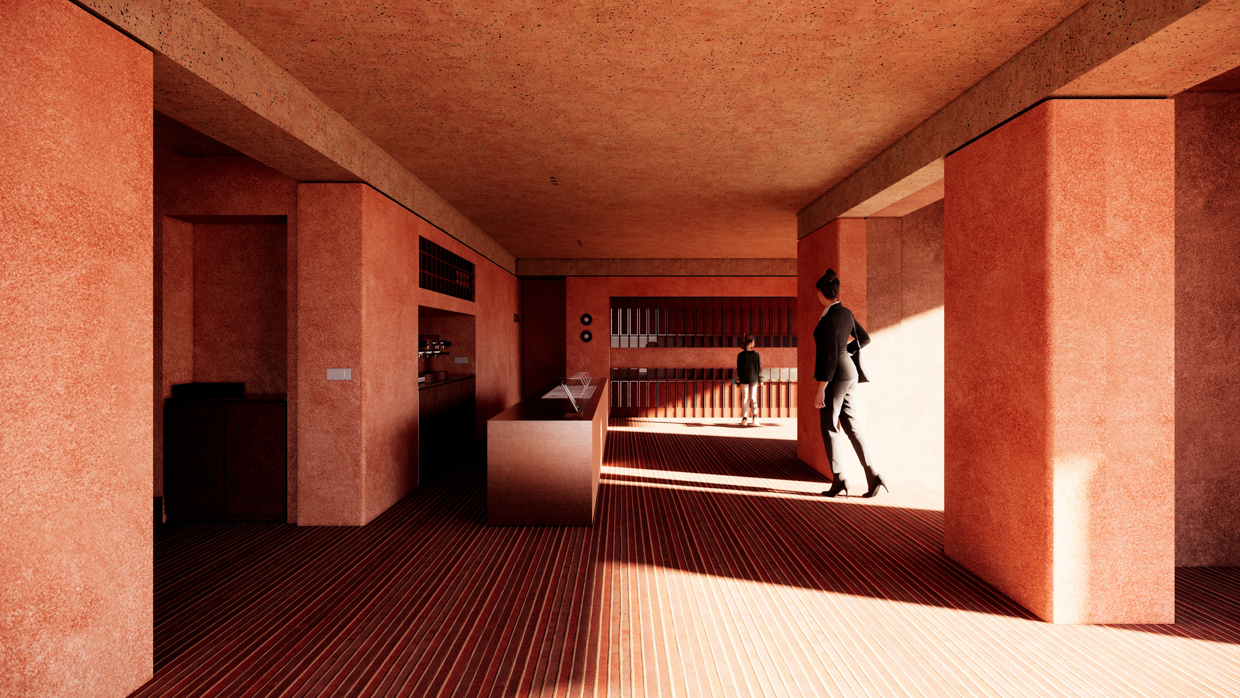
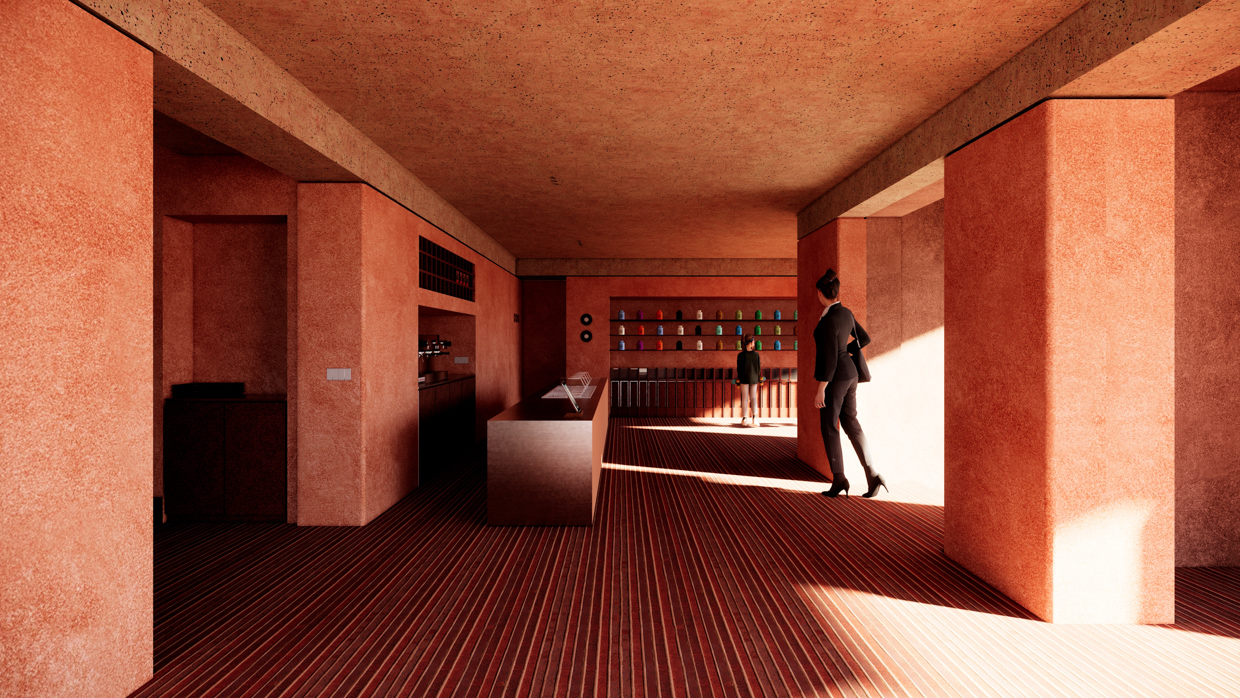
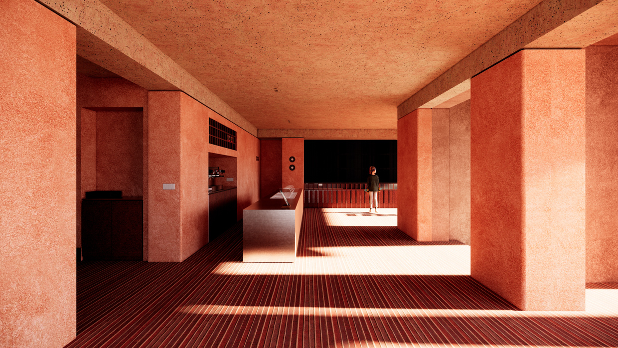
최소한의 불필요한 구조물과 돌출 계단 등을 정리하고, 서비스 동선과 고객 동선을 구분했다. 드러나는 형태는 기존 골조에서 크게 바꾸지 않고, 무언가 새롭게 만든다는 개념에서 벗어나 이 공간을 리터치한다는 개념에 가깝게 작업을 했다. 벽천장이 만나는 엣지를 곡면으로 둥글게 굴려 천장에서 상부 수벽까지를 한 덩어리로 묶고, 20mm의 깊고 굵은 메지를 통해 질감과 색상톤만으로 구분시켰다. 날이선 기둥, 모서리벽들도 둥글게 굴리는 등 스페셜페인팅이 지나갈 자리에 초석을 만들기 위한 부분을 집중했고 자세히 봐야 보일만한 디테일에 신경을 썼다. 그 작은 부분들이 결국 “감도” 를 끌어올릴 수 있지 않을까 하는 숨은 의도였다. 물론 목공작업에 비용과 시간이 오래 걸릴 수 있지만, 의도 한대로 만들어 내면 멋질 수 있을 것이라는 확신이 들었다. 많이 채우기 보단, 꼭 필요한 것들은 매입시켜 그 자리에 꼭 있었던 것 같이 표현하고 싶었다. 비어있는 대지에 새로운 건물을 설계하는 작업과 기존 골조가 있는 리모델링 작업은 작업의 접근성과 태도가 달라야 한다. 건축은 매 상황이 다르고, 소비자의 취향도 다 다르기 때문에 건축가는 수많은 해답지를 가지고 있어야 한다. 특히 상업 시설은 전략을 가진 디렉팅이 필요하다. 마치 매번 다른 캐릭터를 연기하는 배우처럼 건축가도 늘 새로운 캐릭터가 되어보는 노력이 필요하다. 안도타다오의 노출콘크리트처럼, 마리오보타의 벽돌처럼 한가지 주제가 있는 작가 정신도 필요하겠지만 건축은 순수 예술처럼 항상성이 있어야 하는건 아니니까. 매 상황과 각본에 맞는 찰진 연기를 할수 있어야 하니까.
We streamlined unnecessary structural elements and protruding stairs, and clearly separated service circulation from customer circulation. The visible forms were not significantly altered from the existing framework; rather than creating something entirely new, we approached the project as a “retouch” of the space. Edges where walls and ceilings meet were rounded into smooth curves, tying the ceiling and upper water wall into a single continuous volume. A 20mm-deep, bold joint was used to differentiate areas solely through texture and color tone. We focused on areas where special painting would be applied—sharply angled columns and corner walls were rounded, creating a foundation for the paintwork. Attention was given to details subtle enough to be noticed only upon close inspection. The underlying intention was that these small touches could ultimately enhance the overall “sensitivity” of the space. Of course, such carpentry work can be time-consuming and costly, but I was confident that, if executed as intended, it would create a striking effect. Rather than filling the space excessively, we recessed only what was necessary so that each element would feel as if it had always belonged there. Designing a new building on an empty site differs fundamentally from remodeling an existing structure; the approach and mindset must adjust accordingly. Architecture is always context-dependent, and client preferences vary widely, so an architect must carry a multitude of solutions. Commercial spaces, in particular, require strategic direction. Just as an actor embodies a new character for each role, an architect must also adapt, becoming a “new character” for every project. While a singular thematic vision, like Tadao Ando’s exposed concrete or Mario Botta’s brickwork, has its place, architecture does not need to possess the constancy of pure art. It must be capable of delivering a compelling performance tailored to each situation and script.
Project – F cafe remodeling & interior
Location – Sinsa-dong, Gangnam-gu, Seoul
Programme – Commercial
Area – 400.0㎡
Duration: 2022.09 – 2022.10
Architect – 아키도형건축사사무소 acdo architects


